![[ OLLY BURROW ]](http://images.squarespace-cdn.com/content/v1/652e4b6d5cedbc2a6c5e4092/f7b14865-2e52-474e-8d71-1a3e0ce3817c/OllyB+copy.png?format=1500w)
JACK DANIEL’S
UK launch campaign
SOLUTION
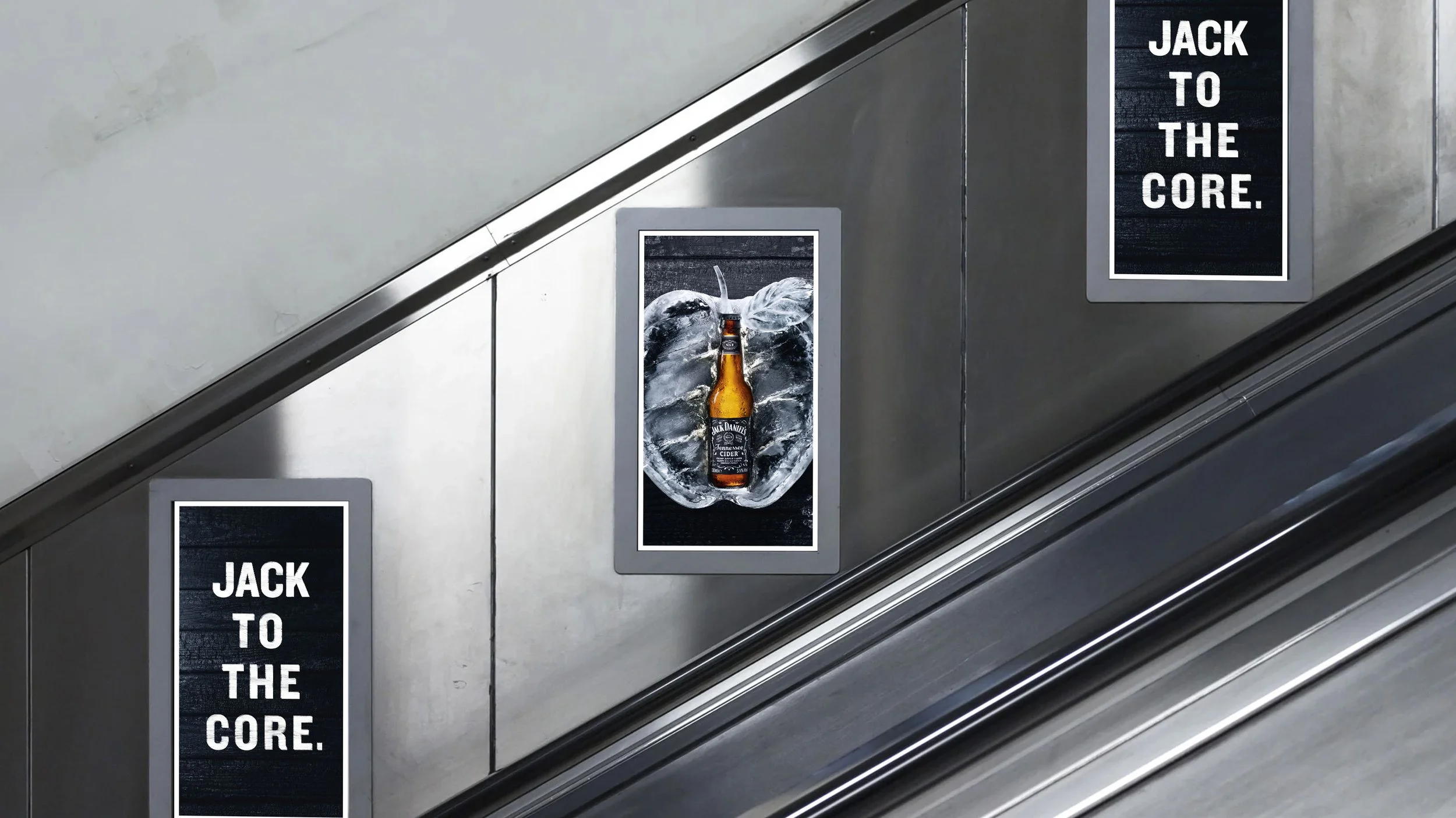
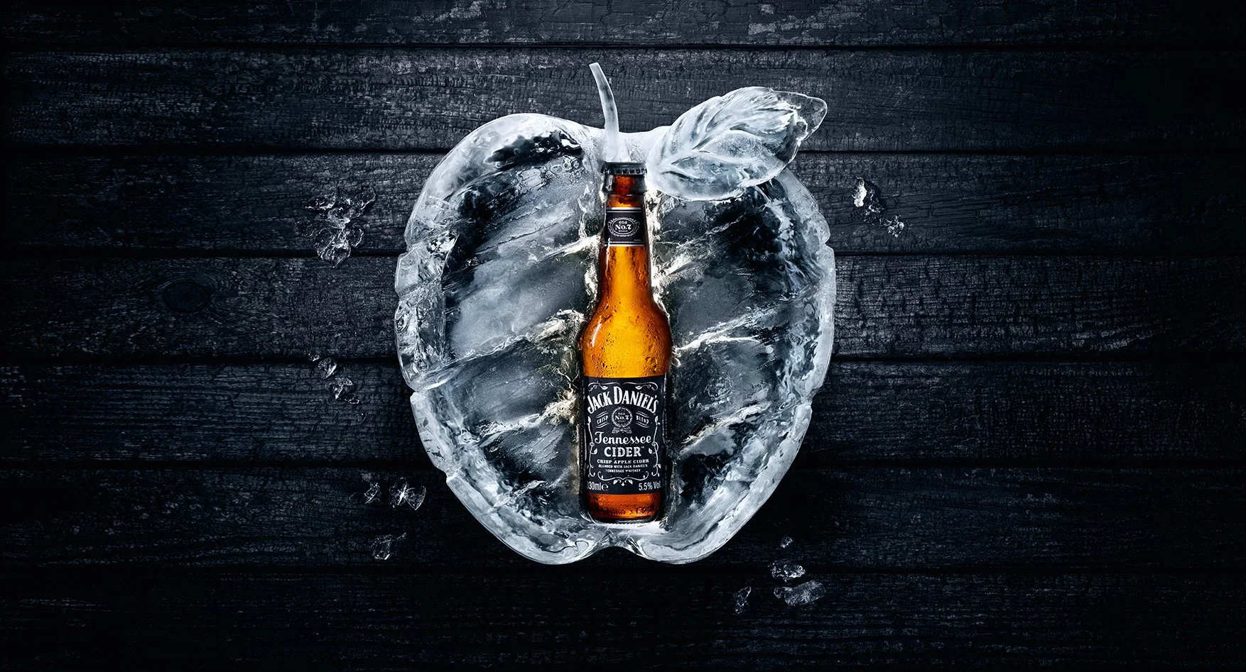
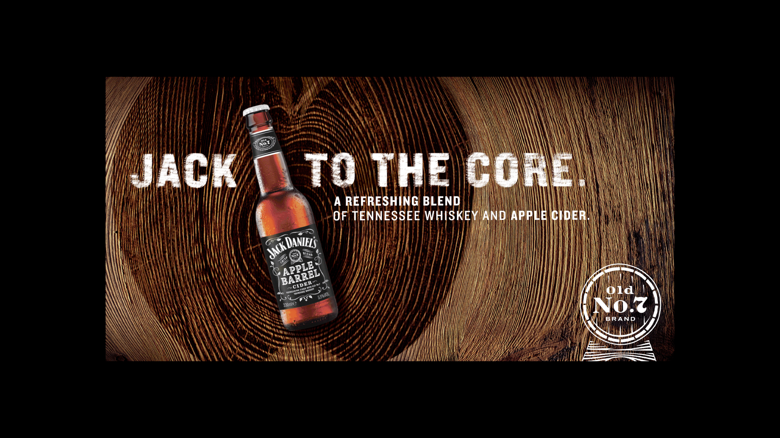
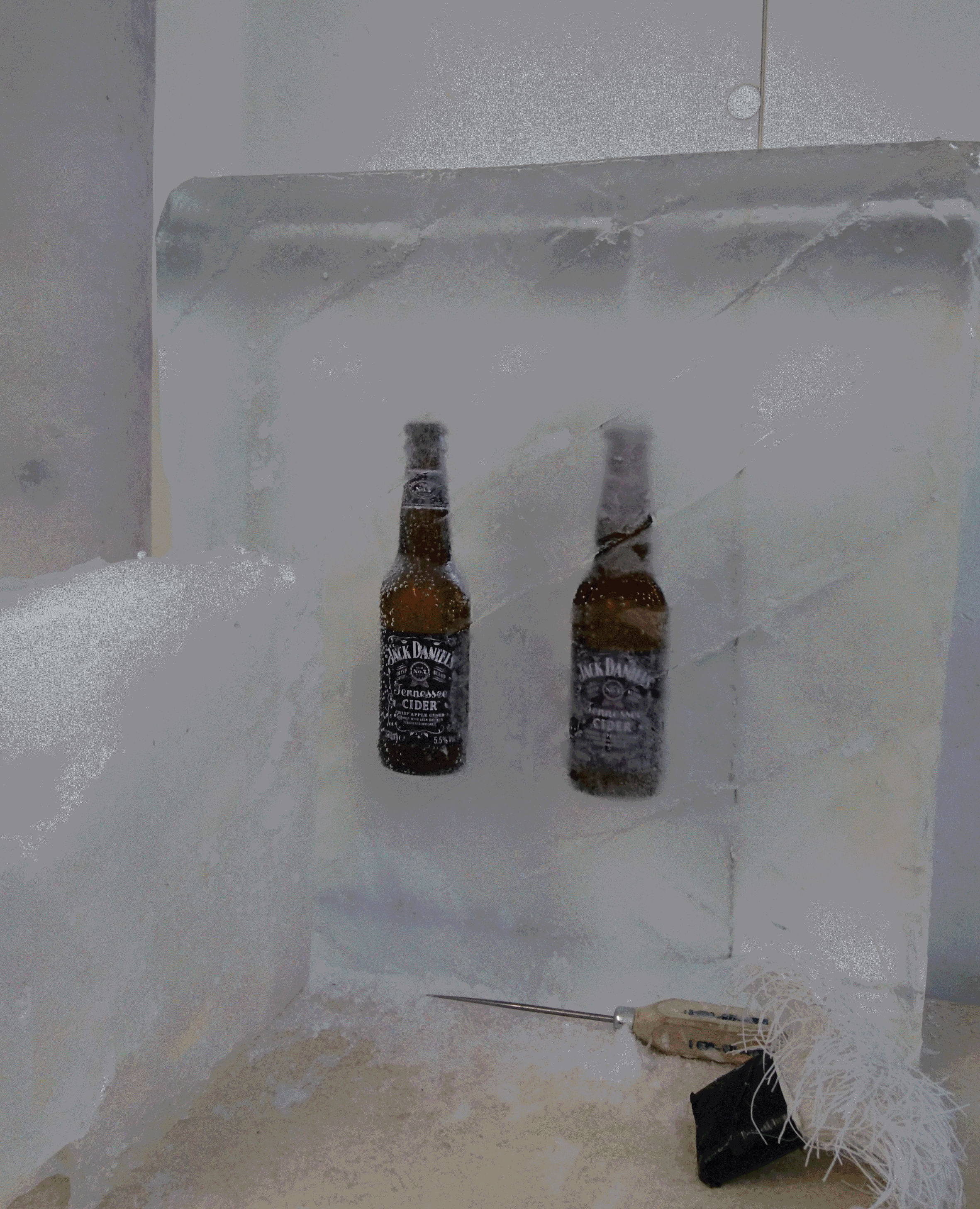
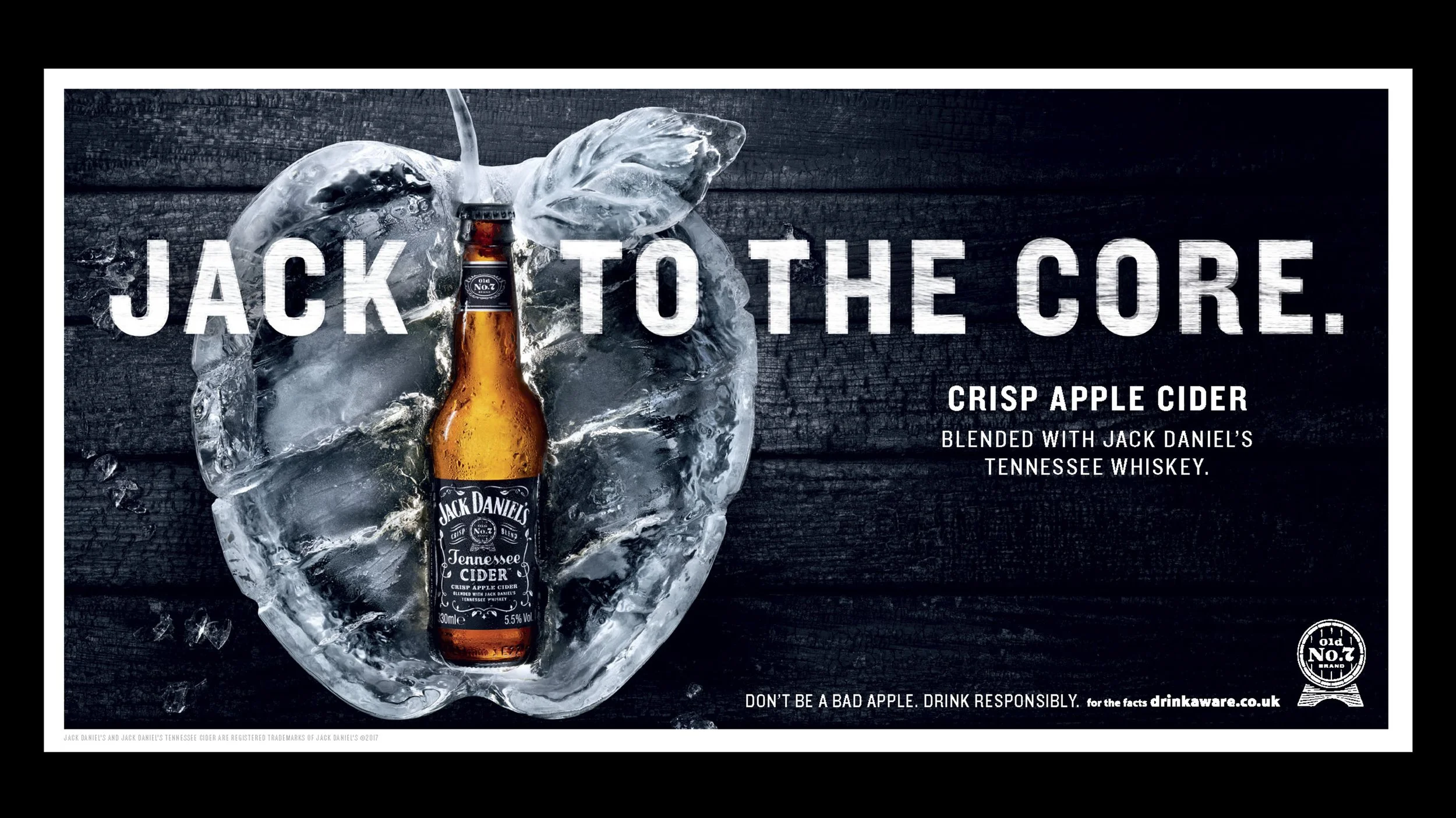
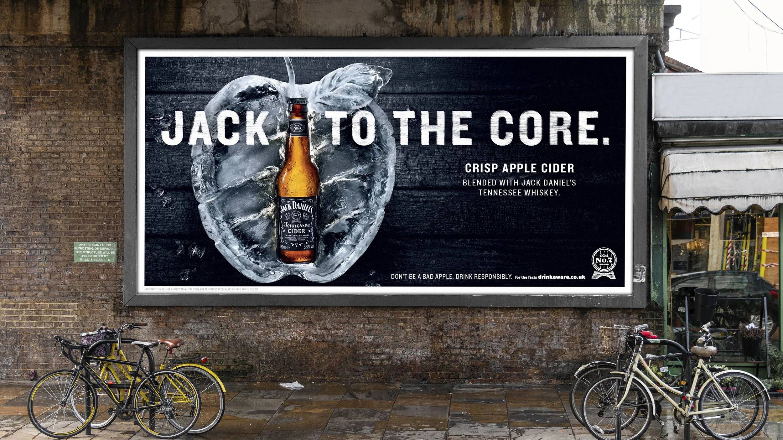
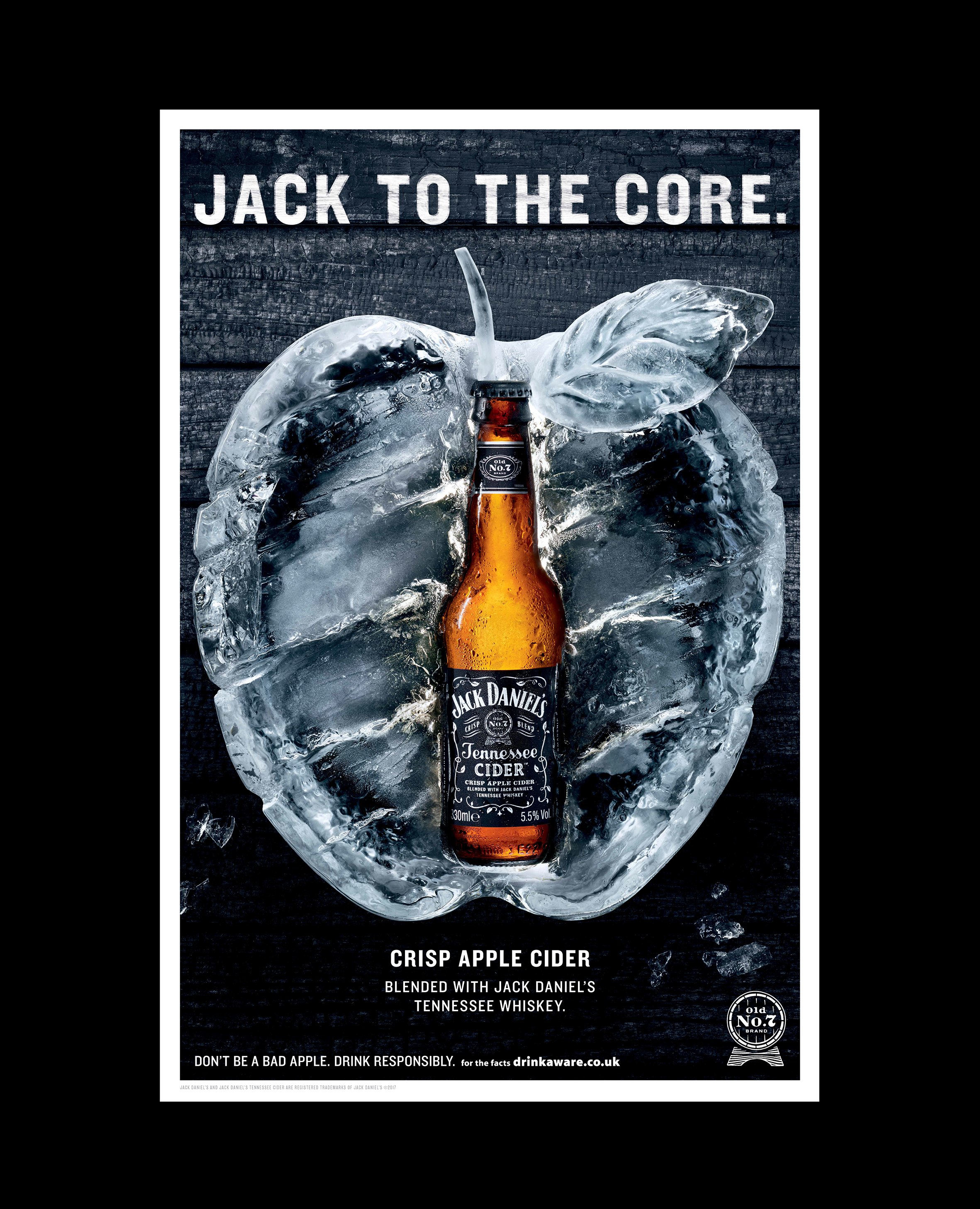
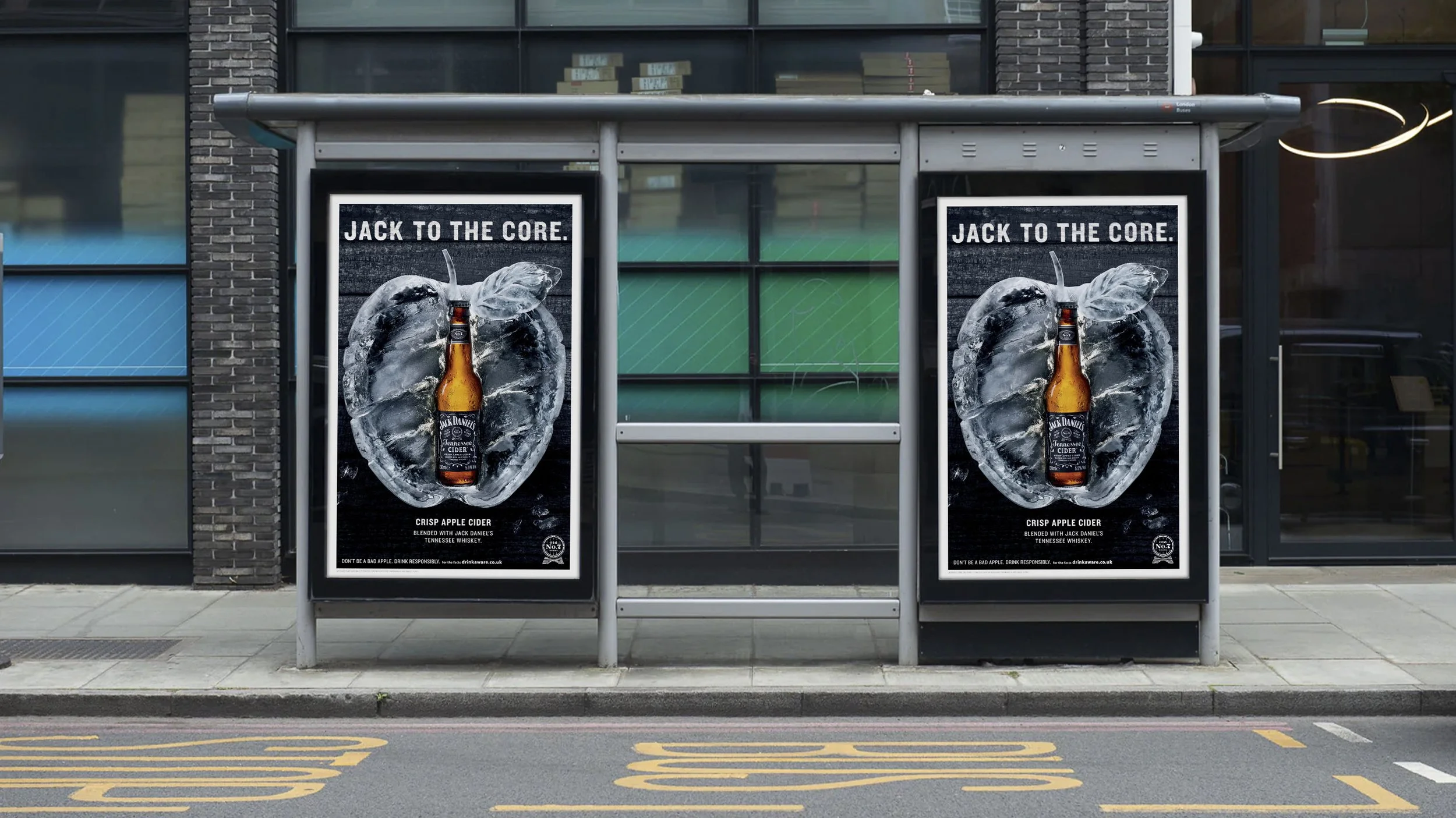
Crafted ice apple with Jack at the core
ROLE
Senior Designer
A UK launch campaign that rethinks how cider should show up in the world. The campaign design didn’t follow the conventional rules of the category and got noticed for it.
DEVELOPMENT
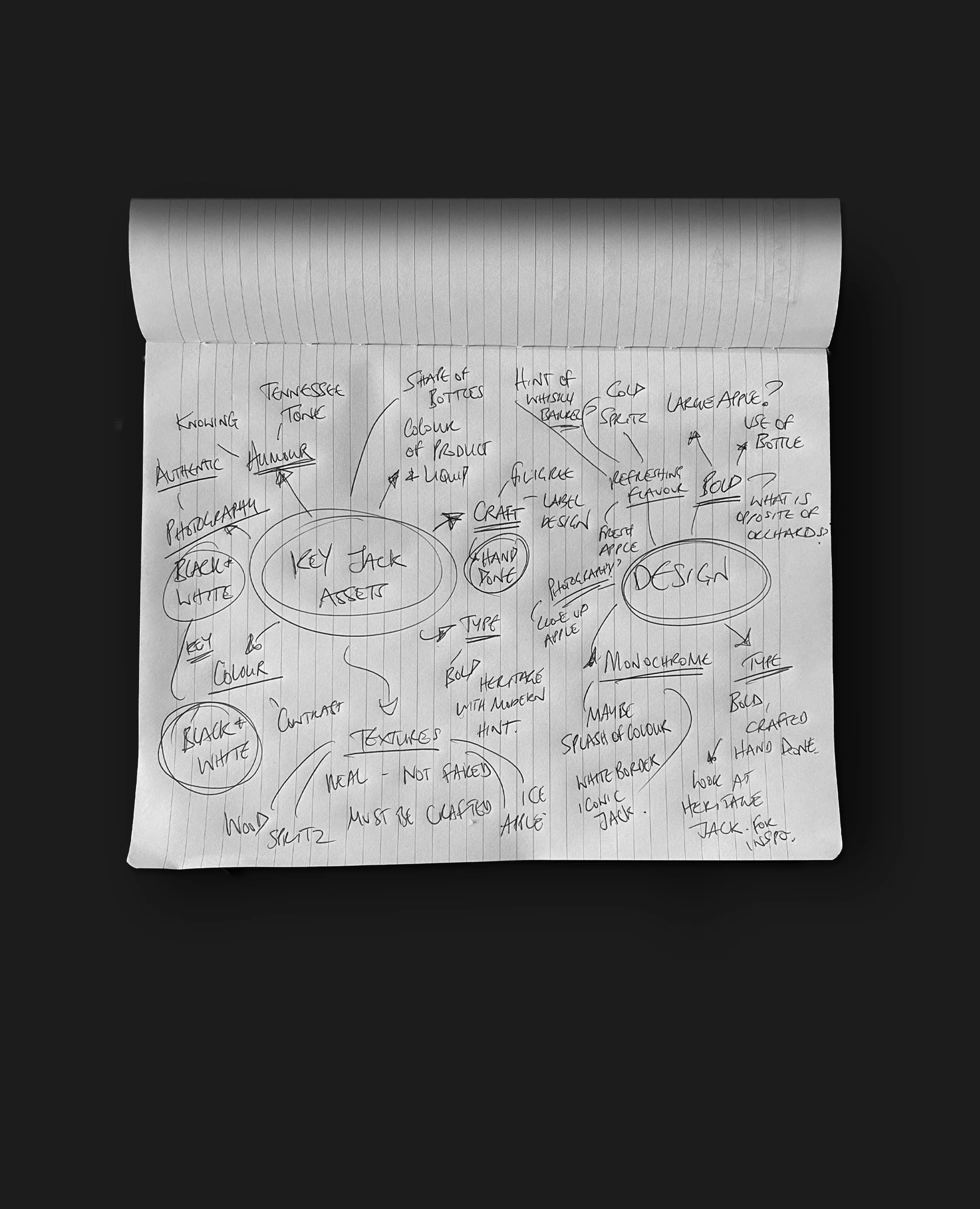
A concept was developed by a create team and I came on board to help define the design language. A wooden route lost out to a sculpted ice apple that expressed all that’s loved about Jack - flavour, craft and a bit of something different.
STAGE
Final design
SOFTWARE
Built in Photoshop
LAUNCH
UK only
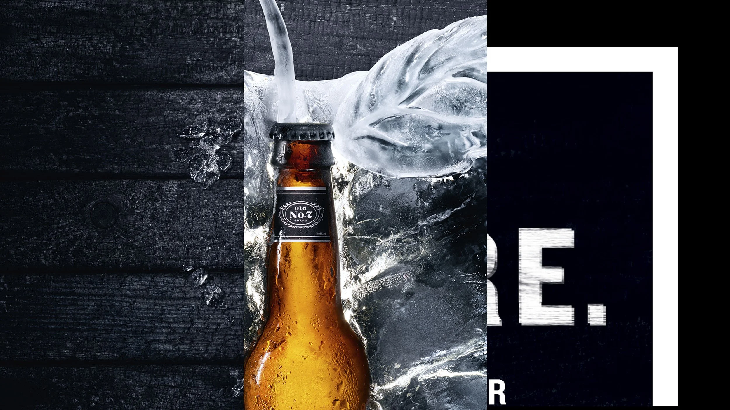
DESIGN LANGUAGE
The typographic style plays into the rugged, textured visual language of Jack Daniel’s. The monochromatic palette was an intentional switch from the saturated orchards of competitors and connected with Jacks rebellious streak.