![[ OLLY BURROW ]](http://images.squarespace-cdn.com/content/v1/652e4b6d5cedbc2a6c5e4092/f7b14865-2e52-474e-8d71-1a3e0ce3817c/OllyB+copy.png?format=1500w)
PAY 4
Brand identity pitch
SOLUTION
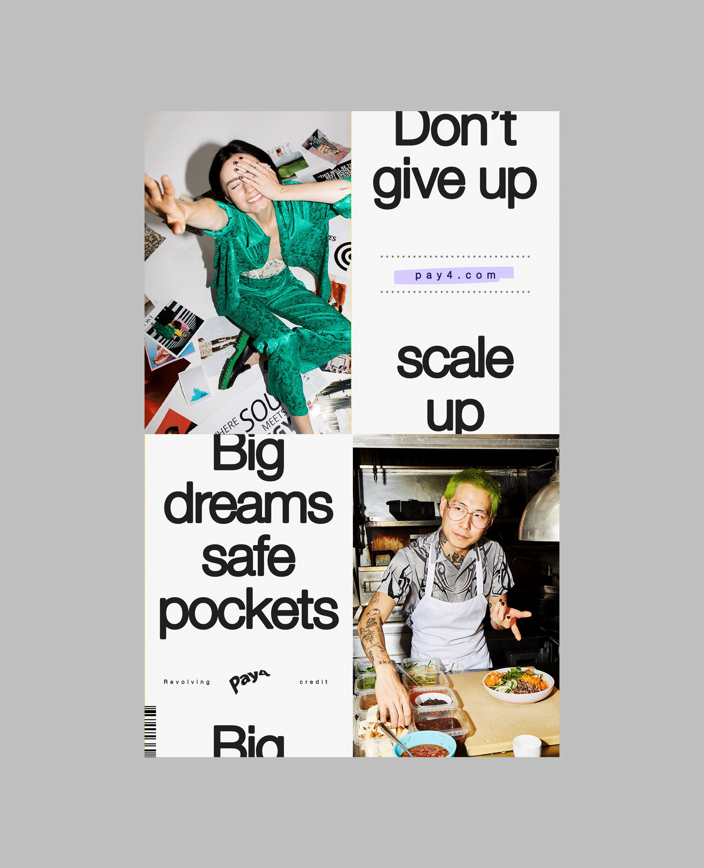
A design system that express its core mission
ROLE
Concept + Design
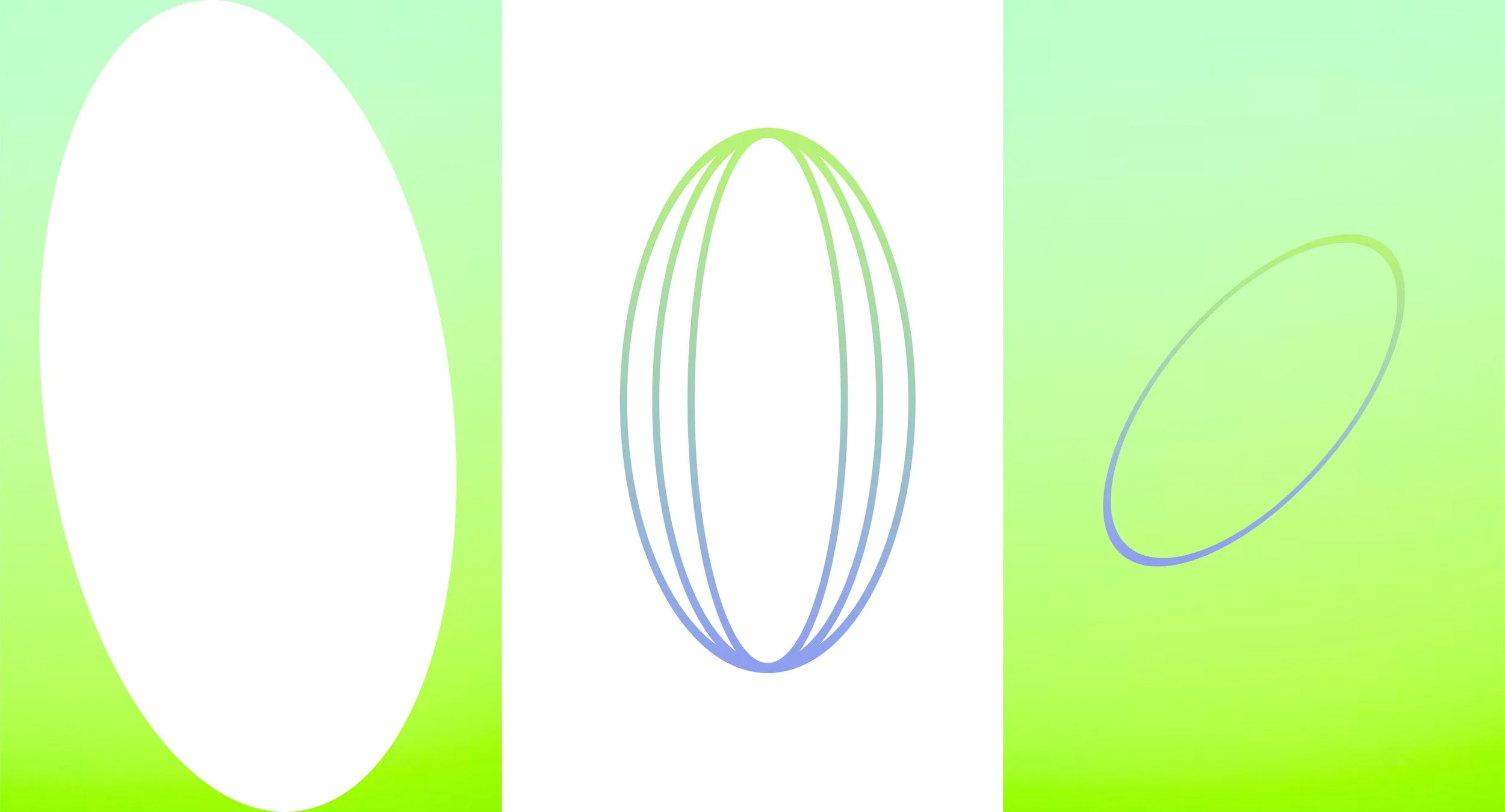
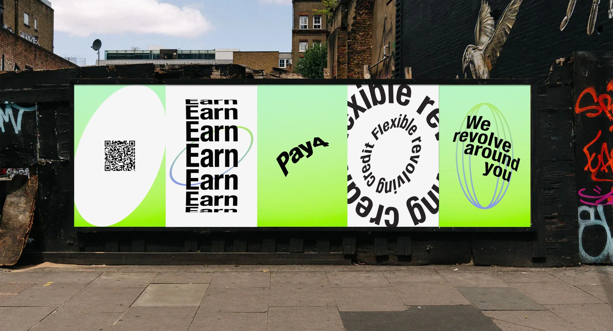
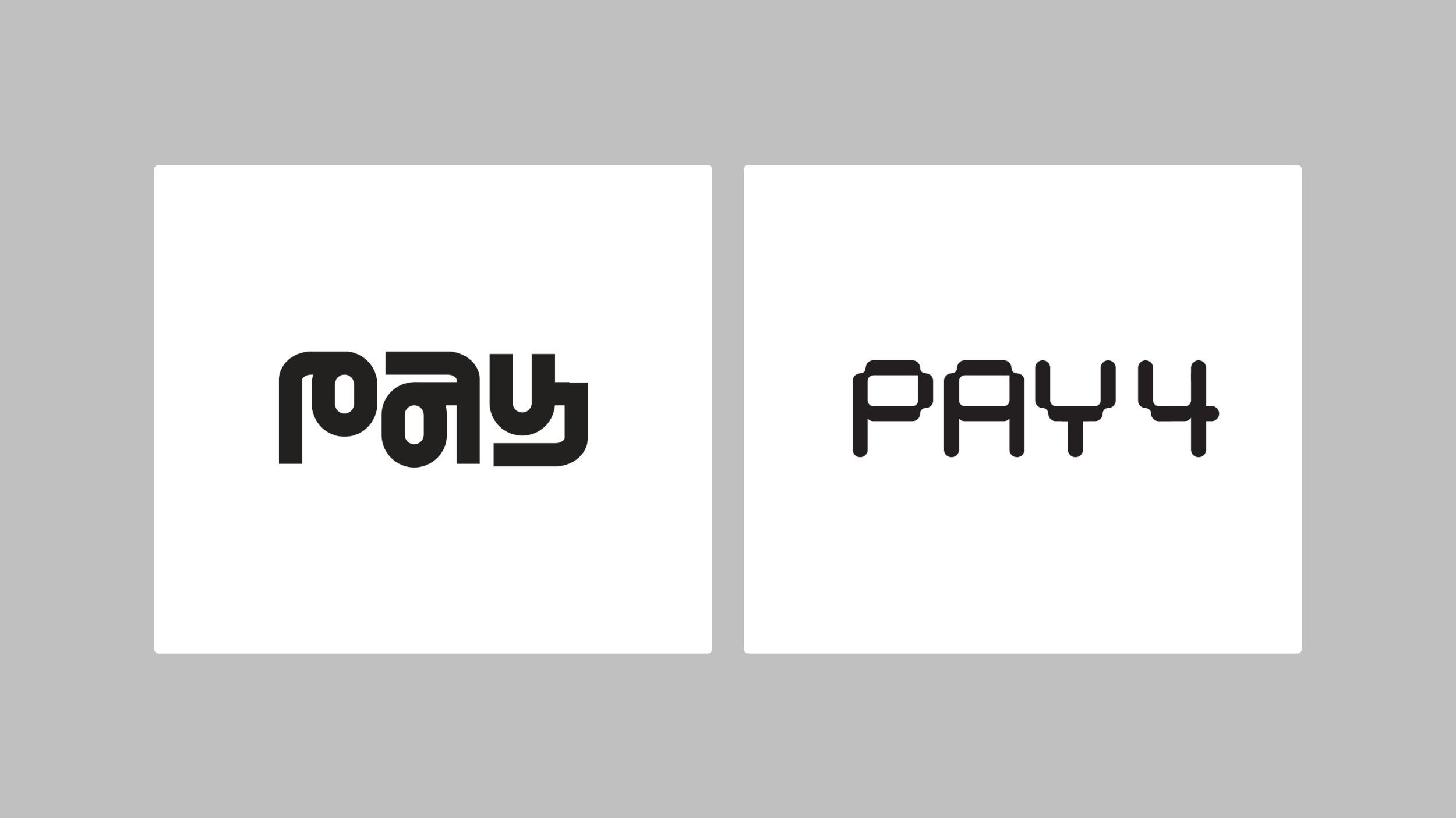
Pay4 is rooted in wrap around financial support for small businesses. Its flexible revolving credit inspired a constantly moving brand mark that orbits a central point.
DEVELOPMENT
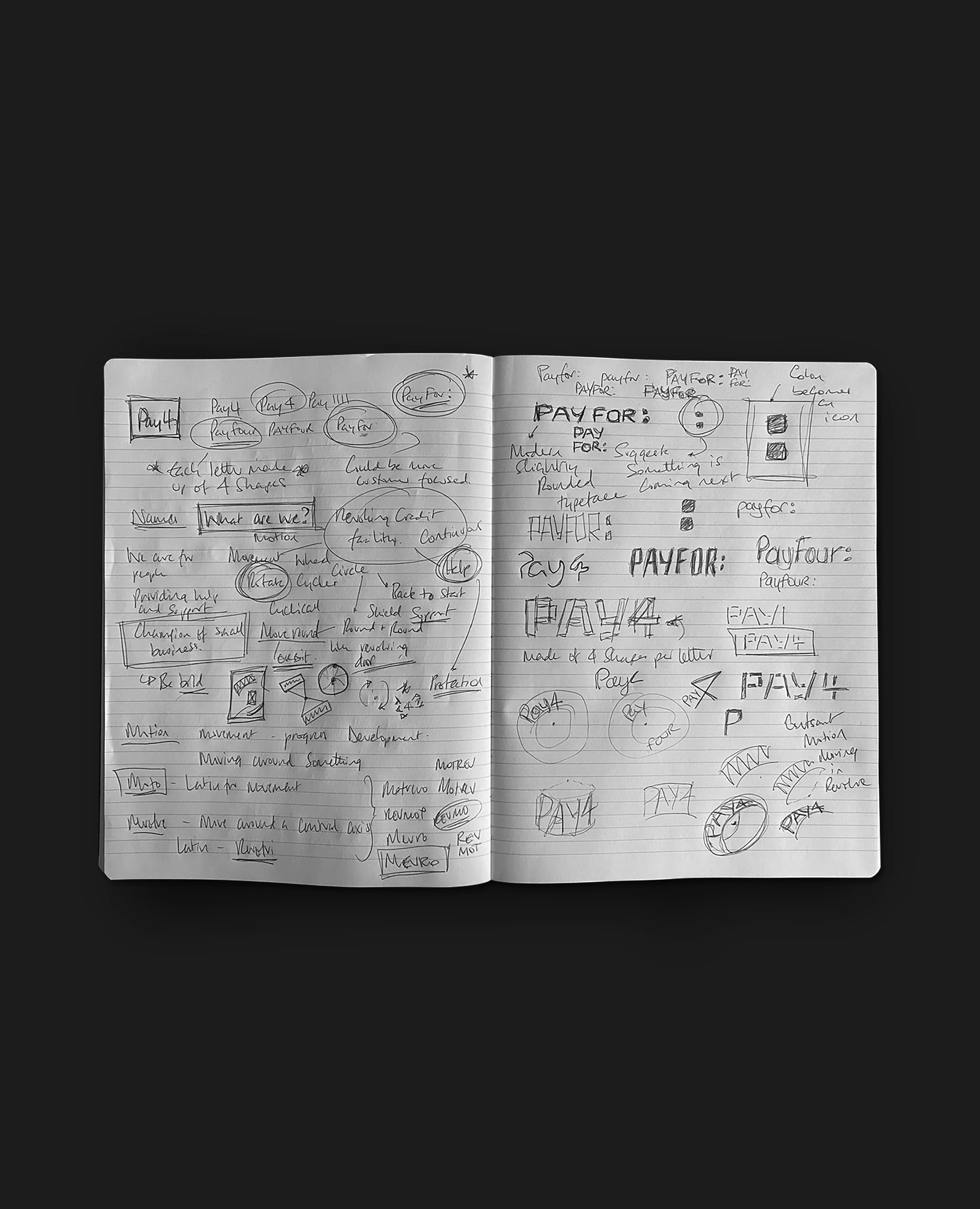
Building block, motion, states of flow, connection were investigated with an orbiting logo ultimately being chosen.
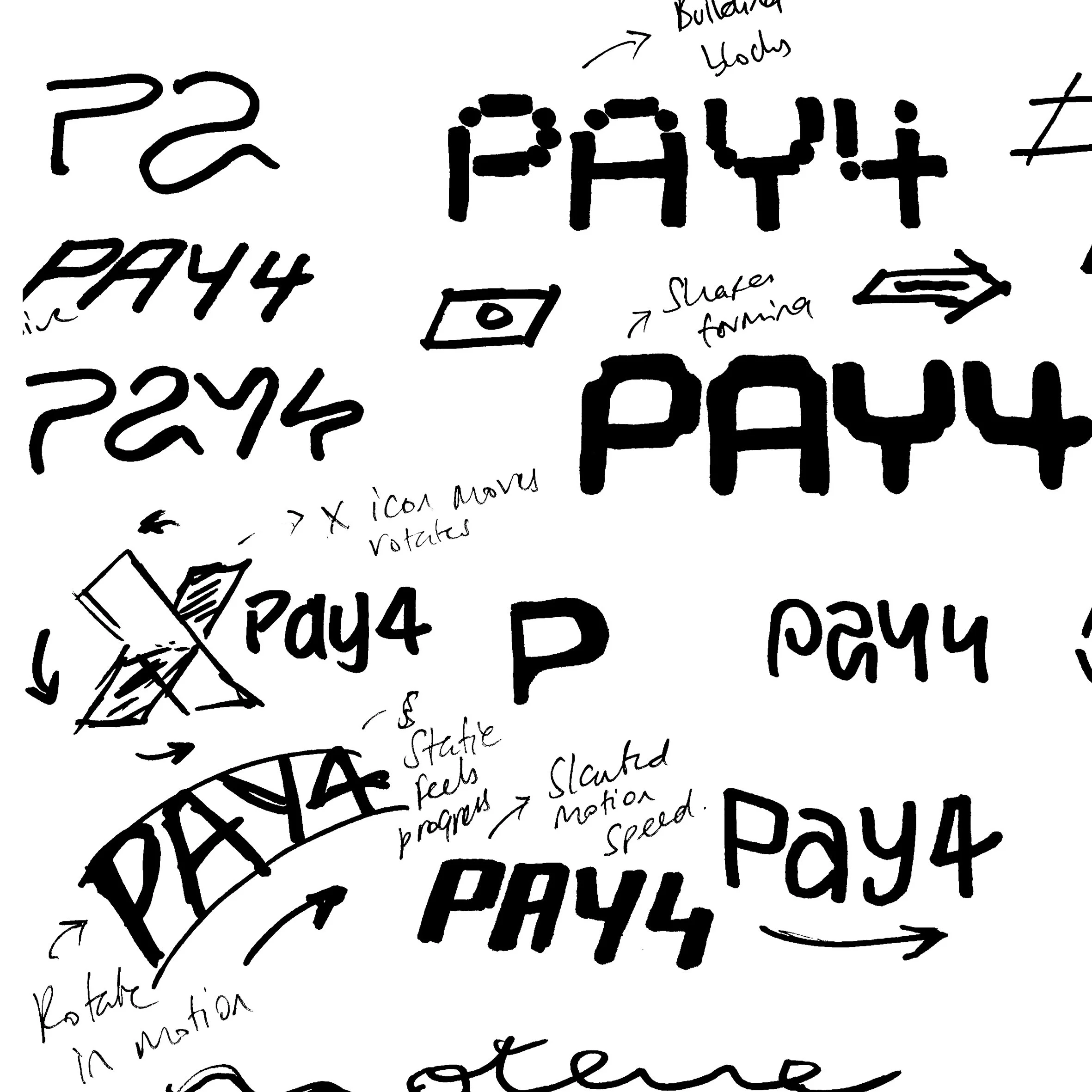
ART DIRECTION
Various territories were explored from morphing shapes to till receipts but the sense of motion through revolving became the bedrock of the identity’s look and feel.
STAGE
Final design
SOFTWARE
Built in Illustrator, Photoshop + After Effects
DESIGN LANGUAGE
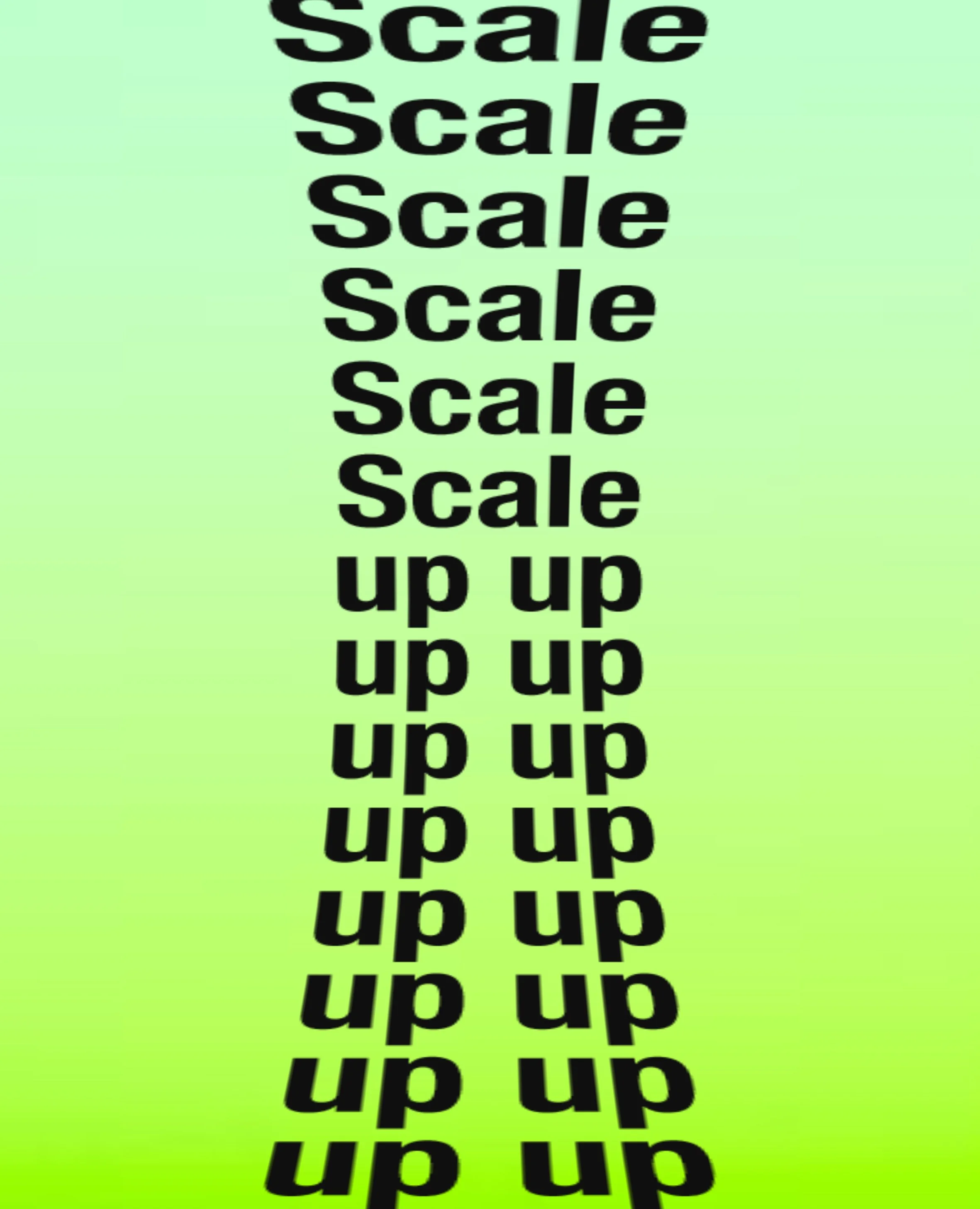
Revolving was the icon of the identity and ran through typography, graphical elements and motion. It delivered a vibrant and future looking identity that could flex effortlessly across channels and formats.