![[ OLLY BURROW ]](http://images.squarespace-cdn.com/content/v1/652e4b6d5cedbc2a6c5e4092/d94a91c1-6529-4334-9514-27dcab5eb4d6/OllyB_W+copy.png?format=1500w)
Jack Daniel’s
Tennessee Cider
[ Campaign ]
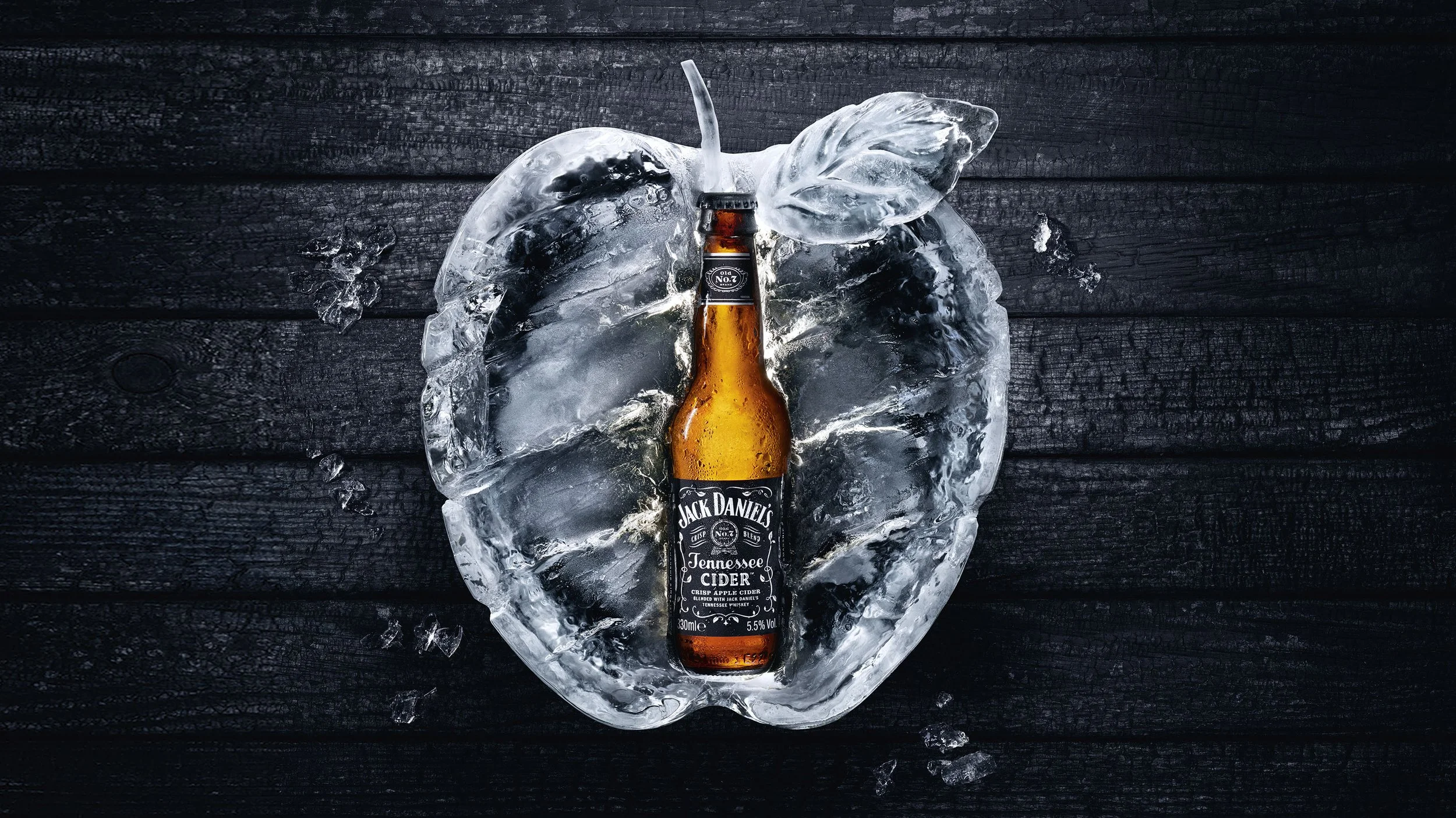
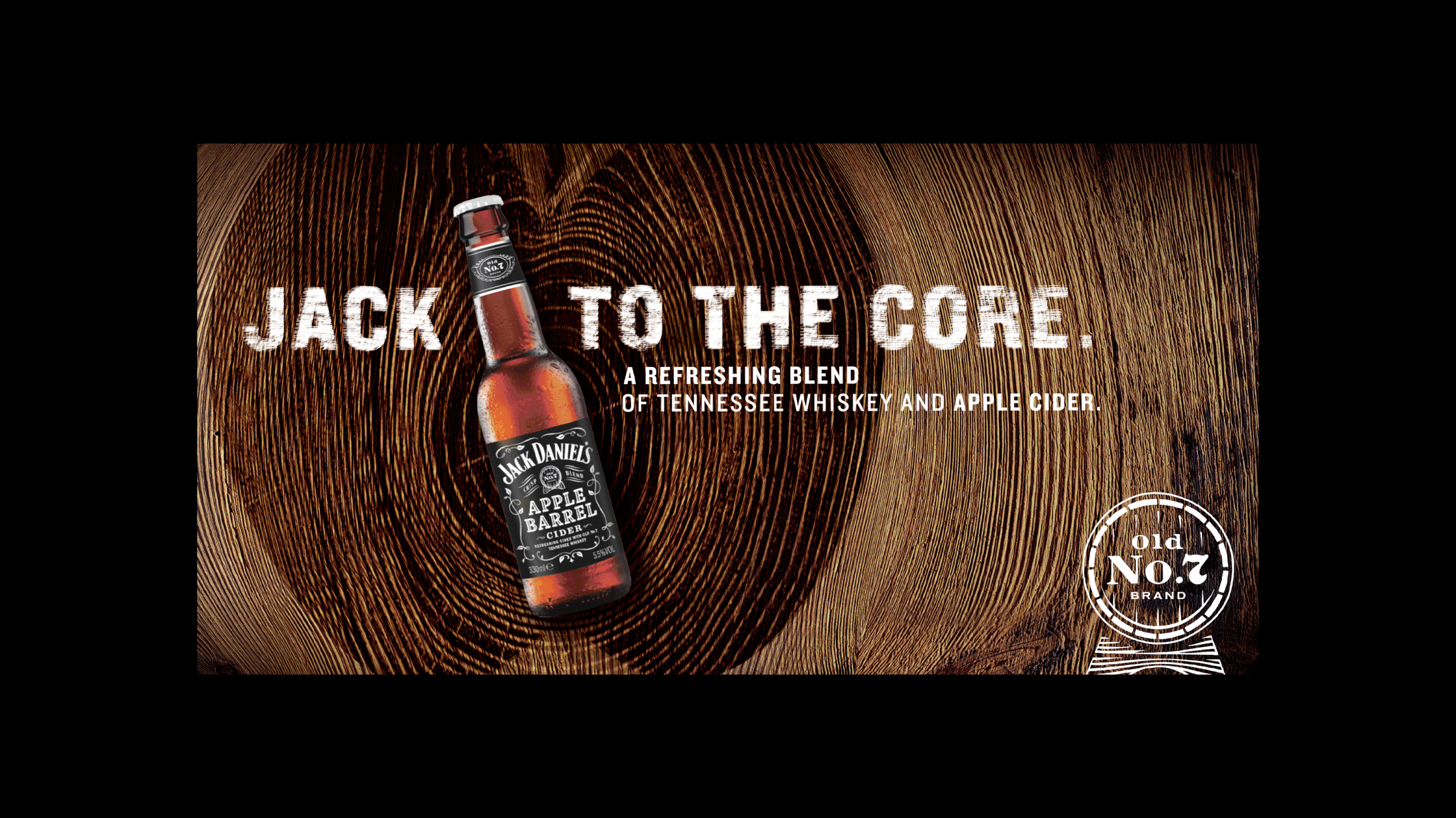
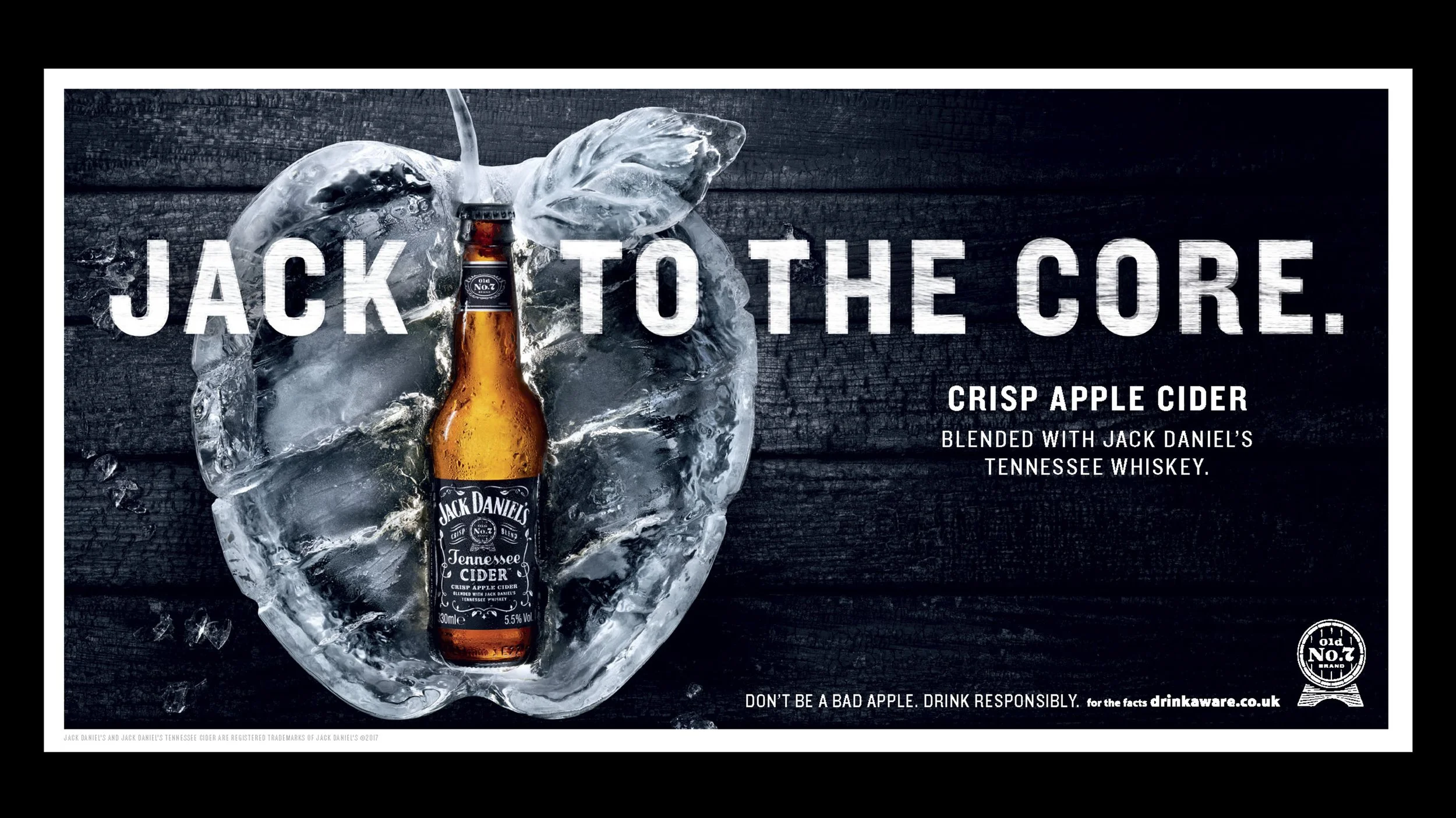
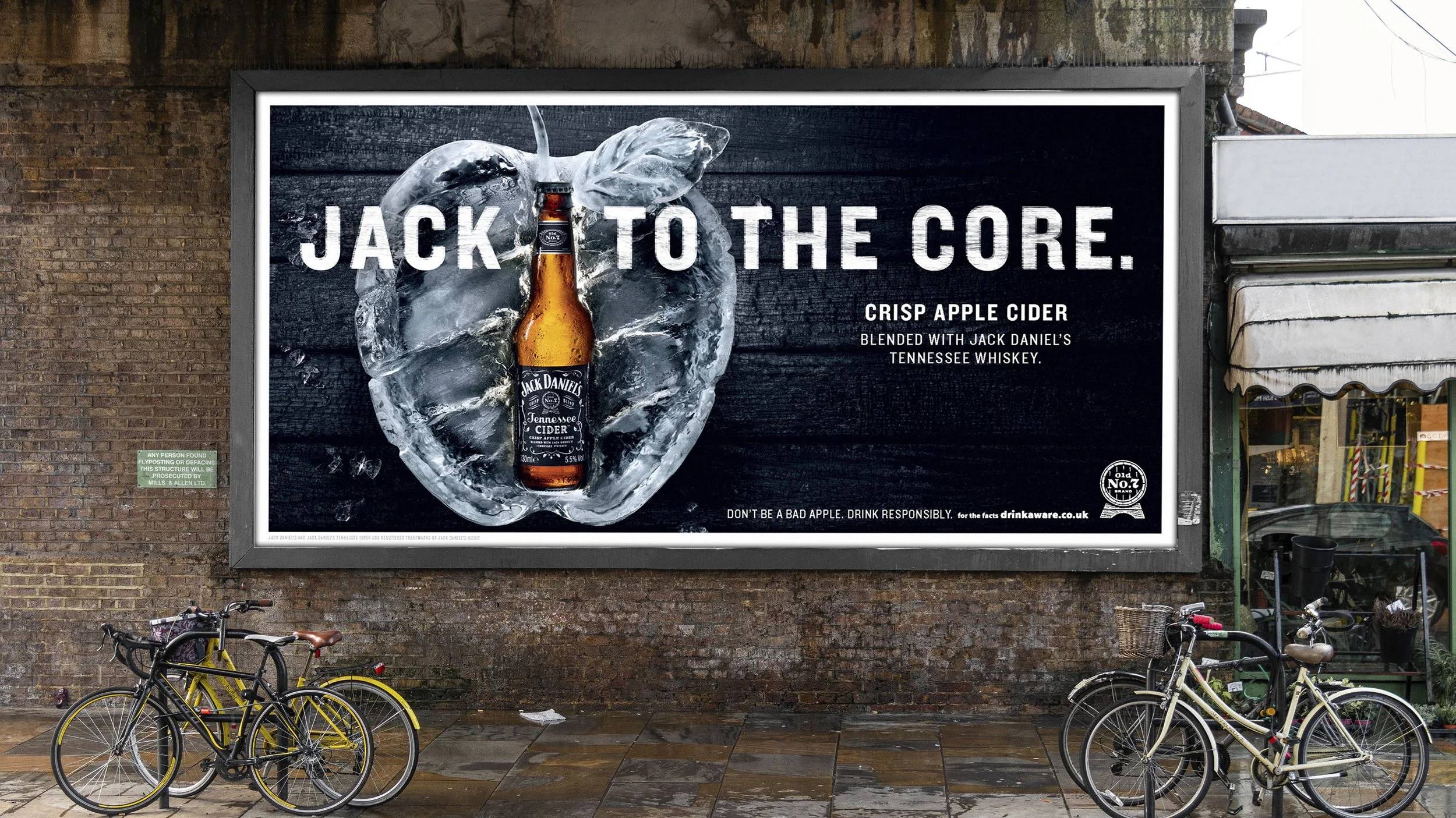
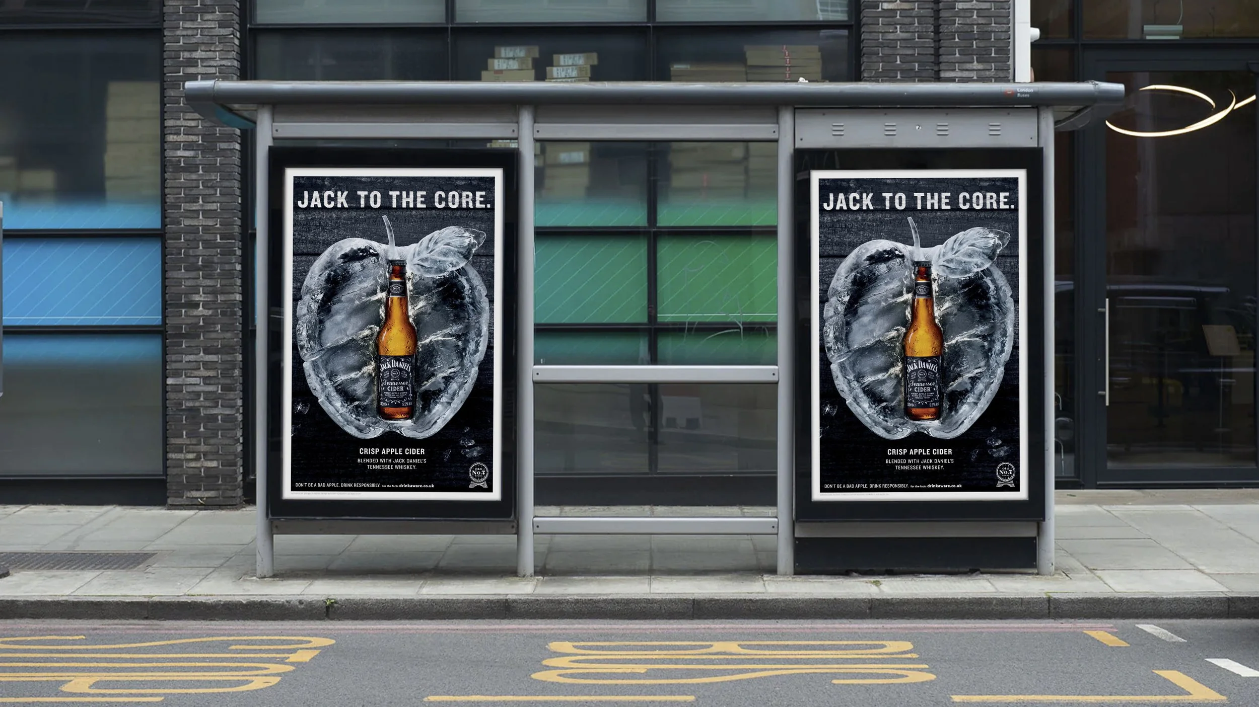
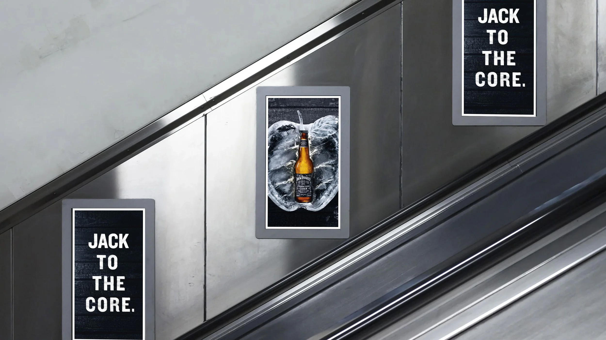
A UK launch campaign that rethinks how cider should show up in the world. The campaign design doesn’t follow the conventional rules of tier. It breaks away from the category tropes. Yes, there is an apple, but not in the expected way. It has craft and connects with the campaign line with a bottle literally at its core. The typographic style plays into the rugged, textured visual language of Jack Daniel’s. The monochromatic palette was an intentional switch from the saturated orchards of competitors and connected with Jacks rebellious streak.
[ Role : Senior Designer ]
[ The Background ]
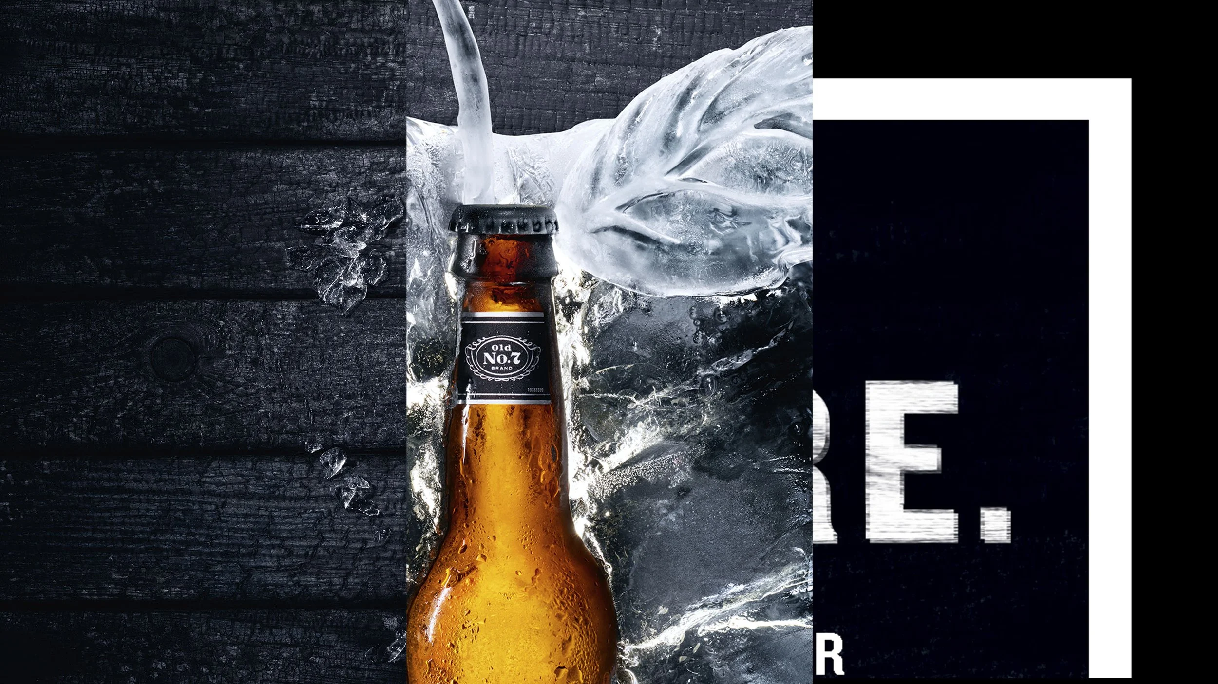
The design stage began with very quick explorations of two visual territories. The wood cut brown style was deemed to safe whereas the ice route was bold and unexpected.
[ The Breakdown ]
Jack is all about craft, and that came through in the beautifully sculpted ice apple and also through the material choice of the black wood, typography and a juxtaposing crisp white frame that enhanced the textural details.
[ Typography construction ]
A bespoke type treatment was created made of distressed layers of the font.