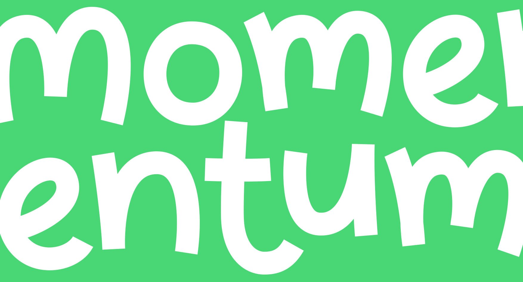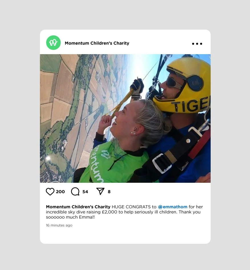
Momentum Children’s
Charity
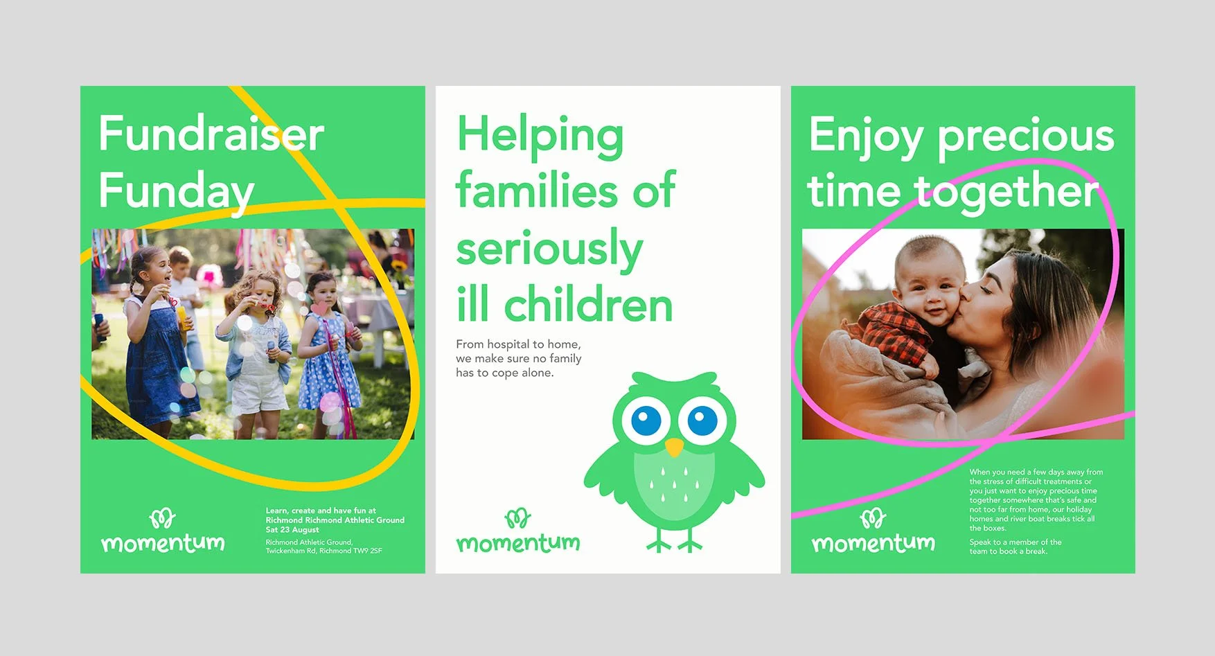
THE BRIEF
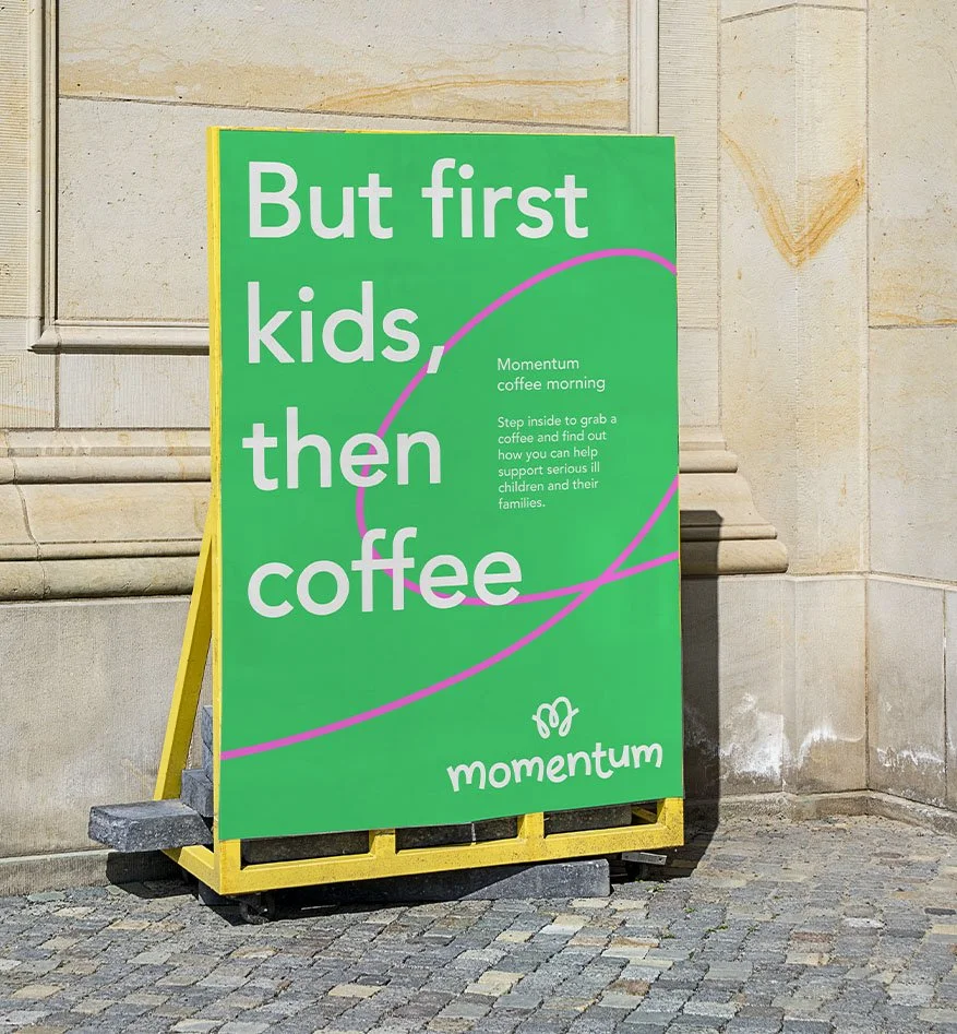
To create a positive brand identity through a unified and cohesive design system that can be implemented by non-designers.
THE SOLUTION
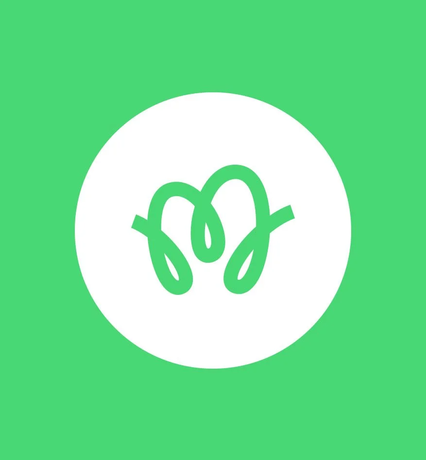
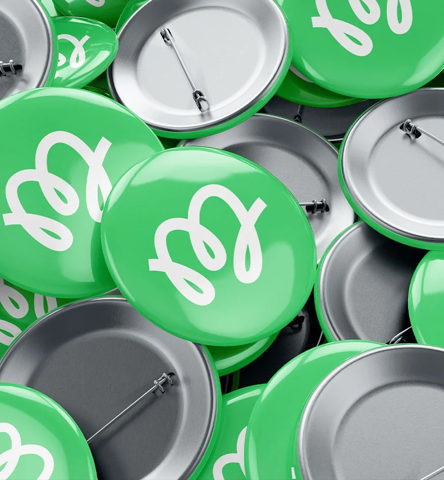
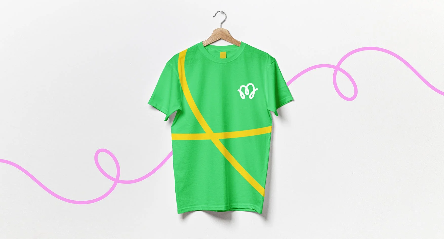
I art directed and designed the logo and identity system that is based round taking on journey’s with a sense of positive momentum.
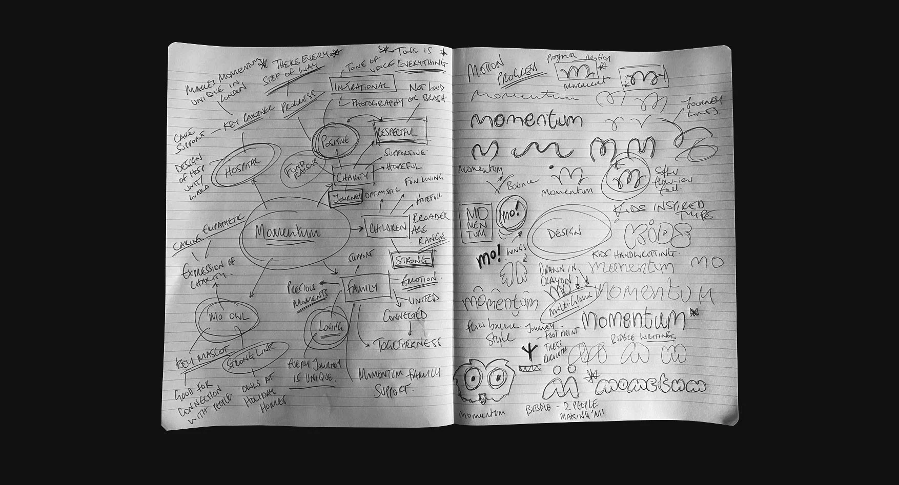
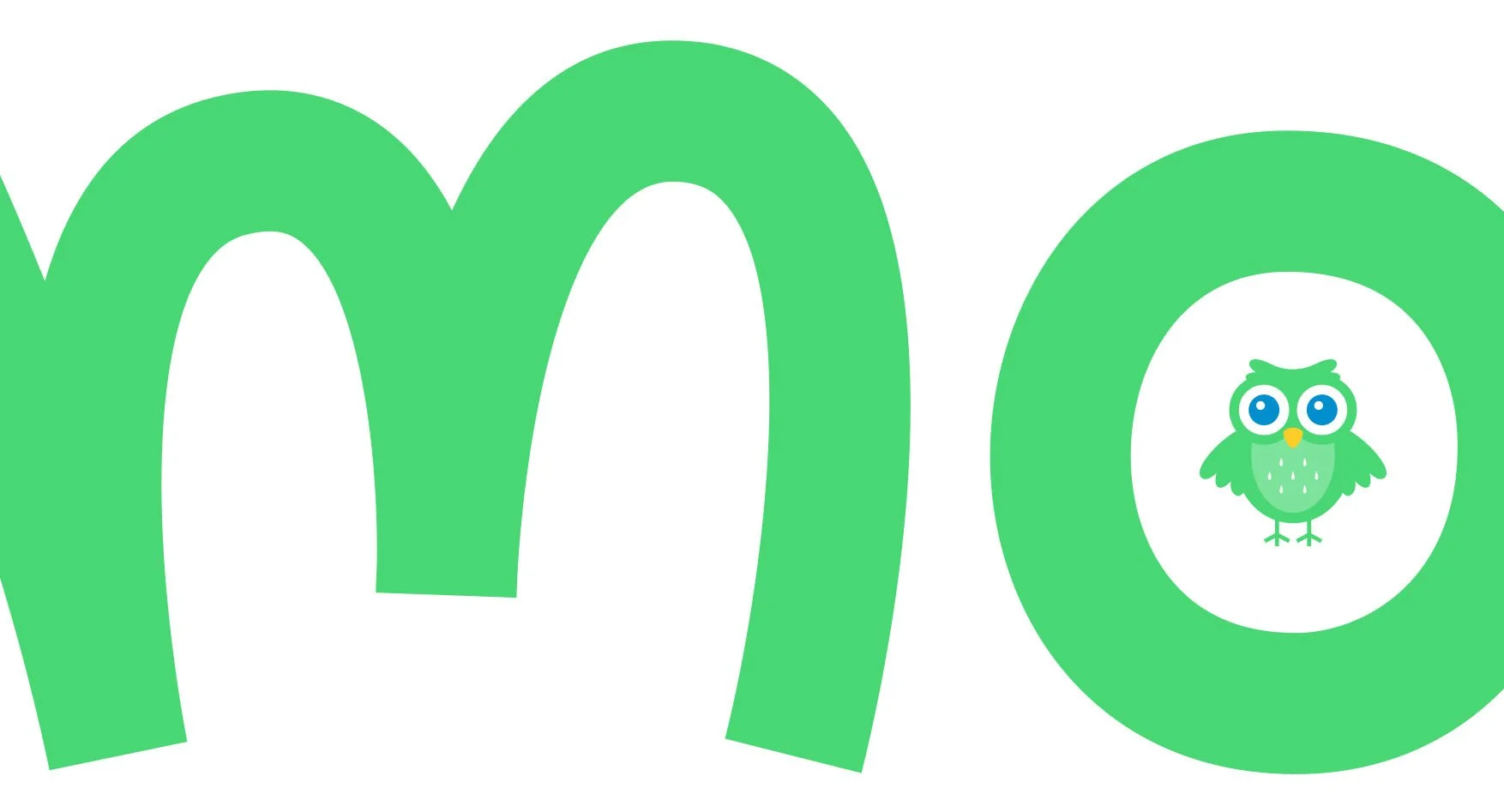
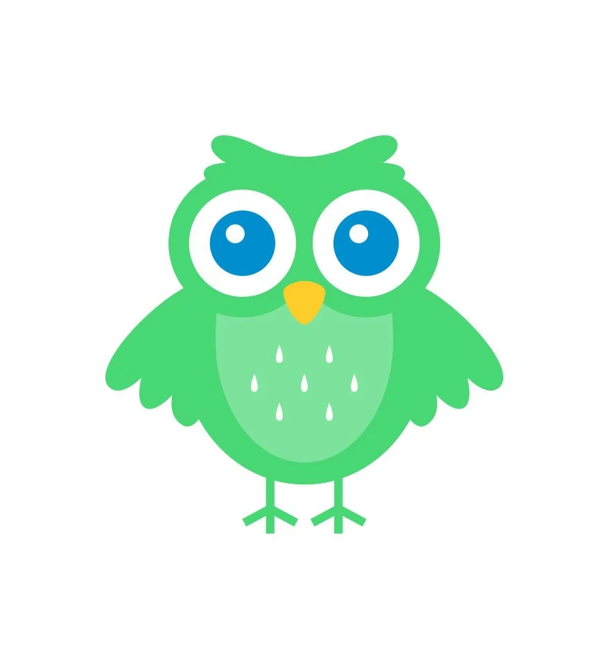
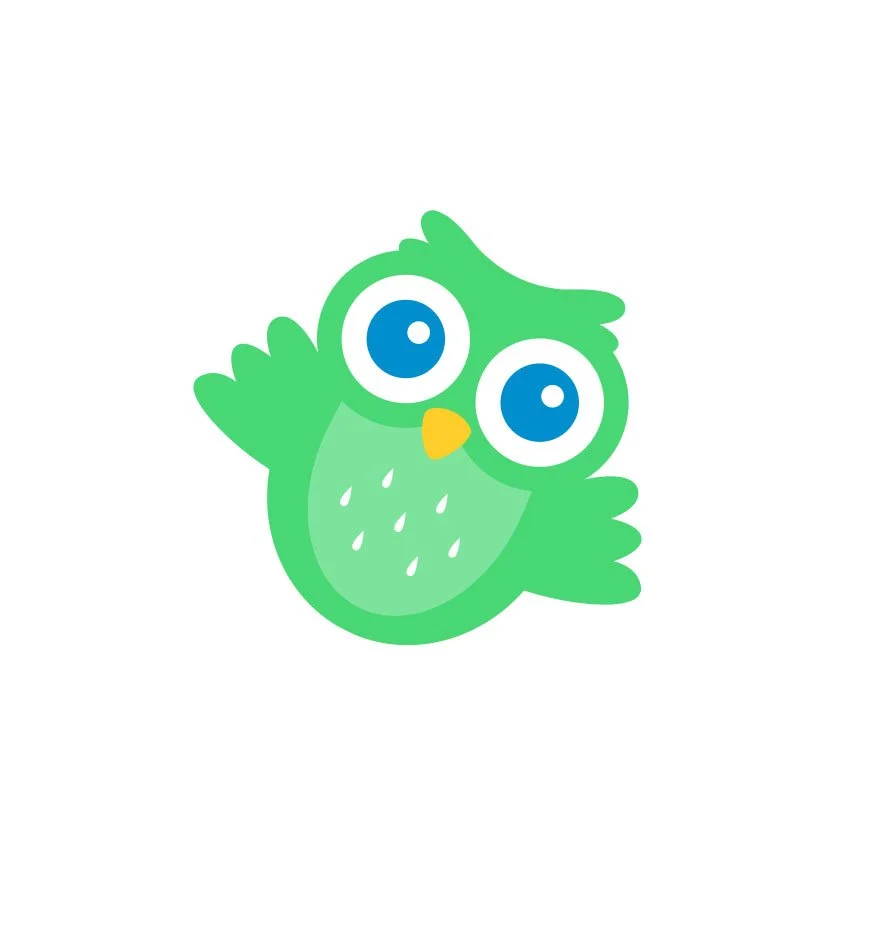
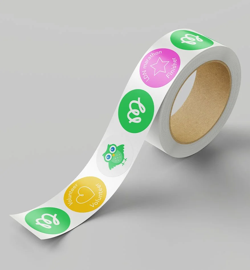
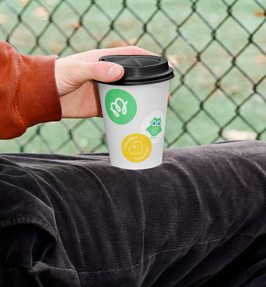
Early development focused on a visual expression of momentum and developing a look for Mo, the charity’s mascot.
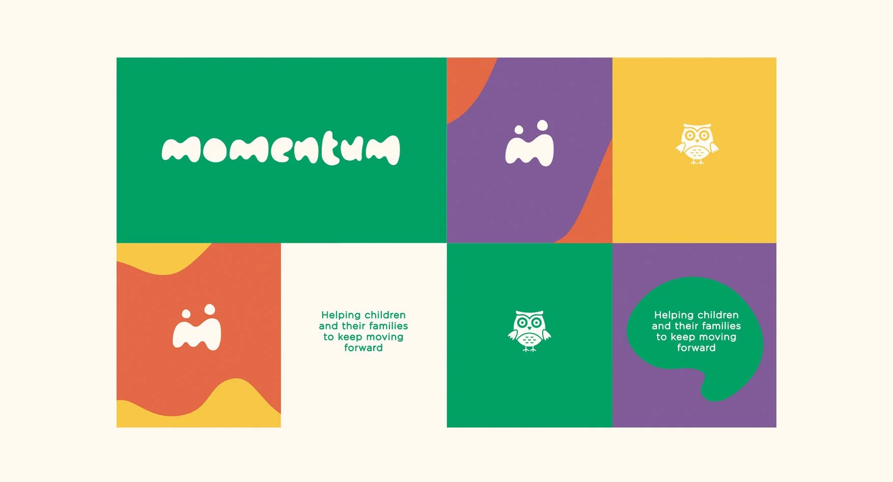
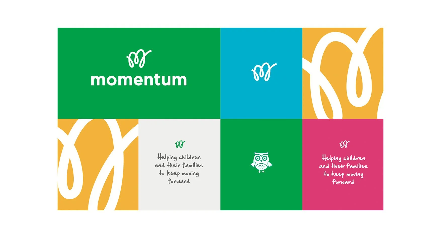
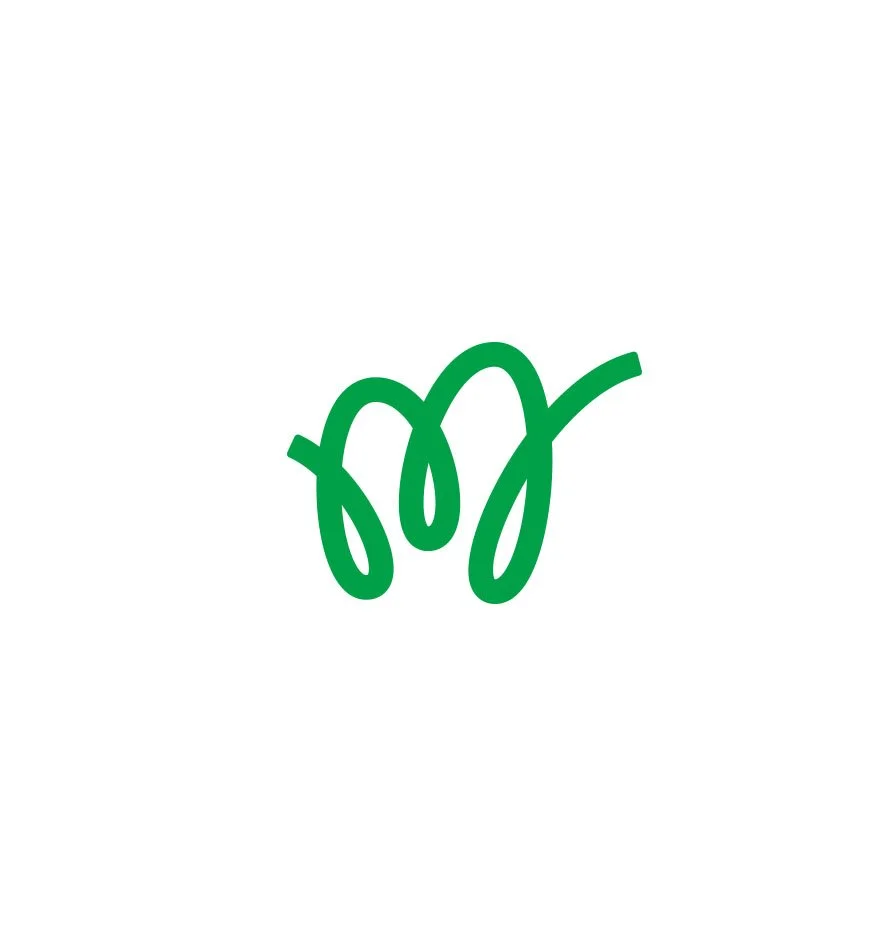
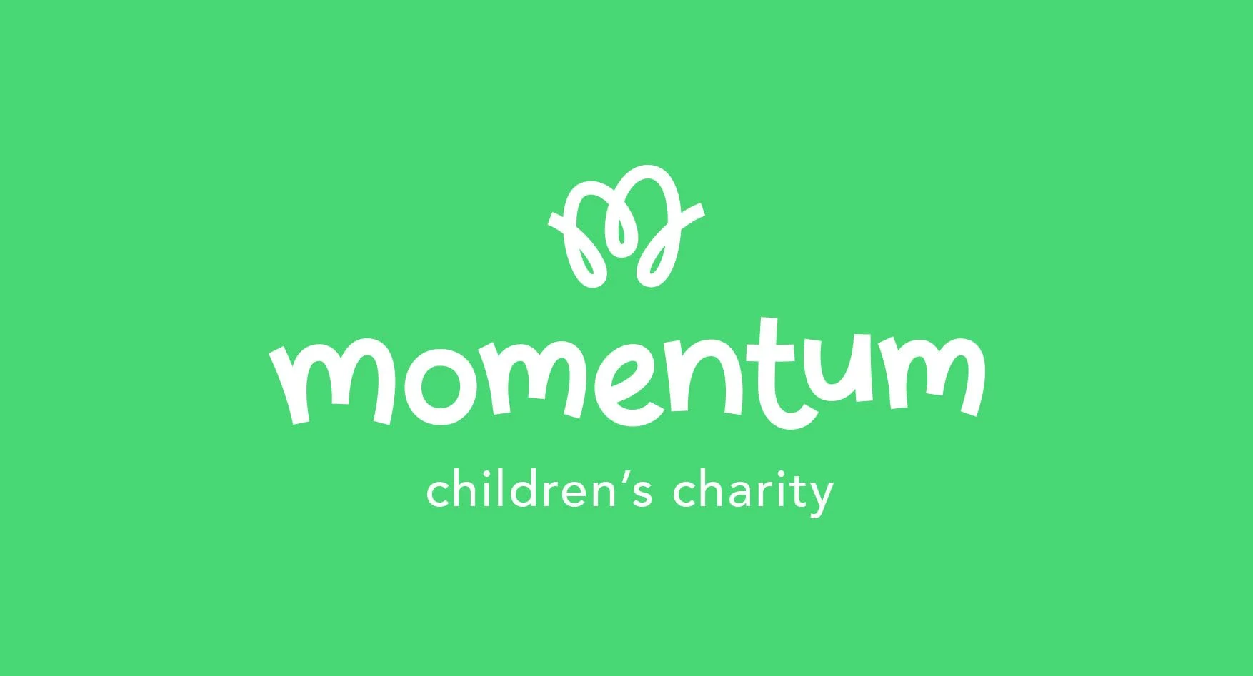
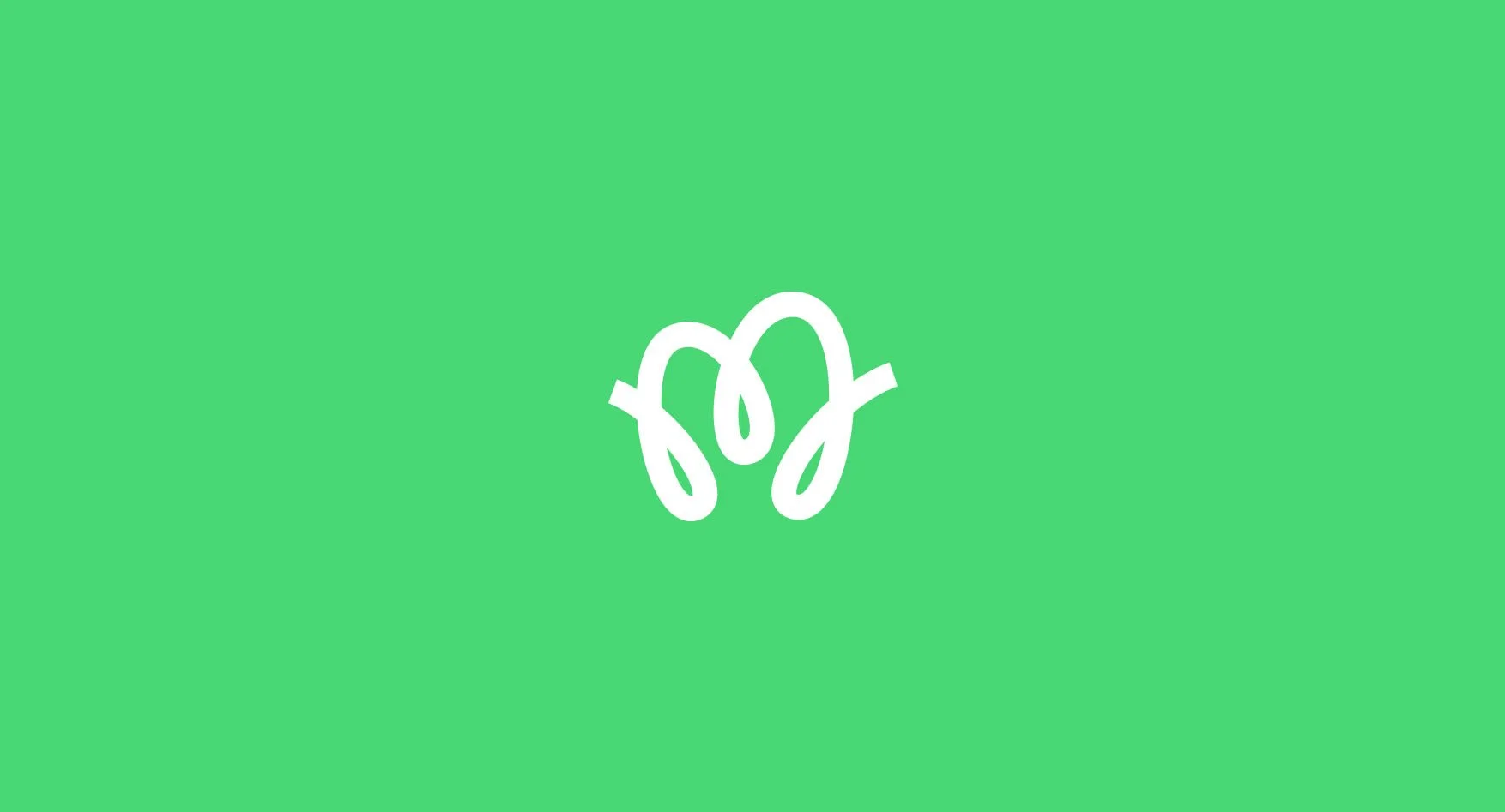
The design approach was all about respectful positivity. The line work of the M logo mark is inspired by motion and the sense that a journey has twits and turns and is not a linear thing. Match with a rounded friendly word mark the design had a fresh youthful look that stayed away from being overly kiddy. Mo the owl was a progression of an icon they had inspired by the owls in the first at Momentum retreats. He gives an extra layer to the approachable tone.