![[ OLLY BURROW ]](http://images.squarespace-cdn.com/content/v1/652e4b6d5cedbc2a6c5e4092/d94a91c1-6529-4334-9514-27dcab5eb4d6/OllyB_W+copy.png?format=1500w)
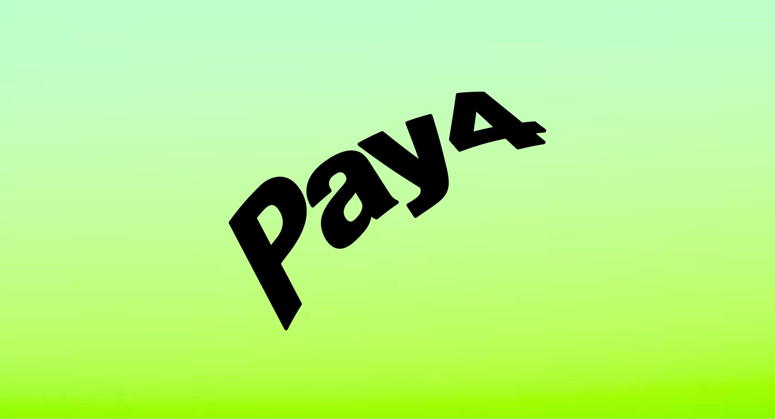
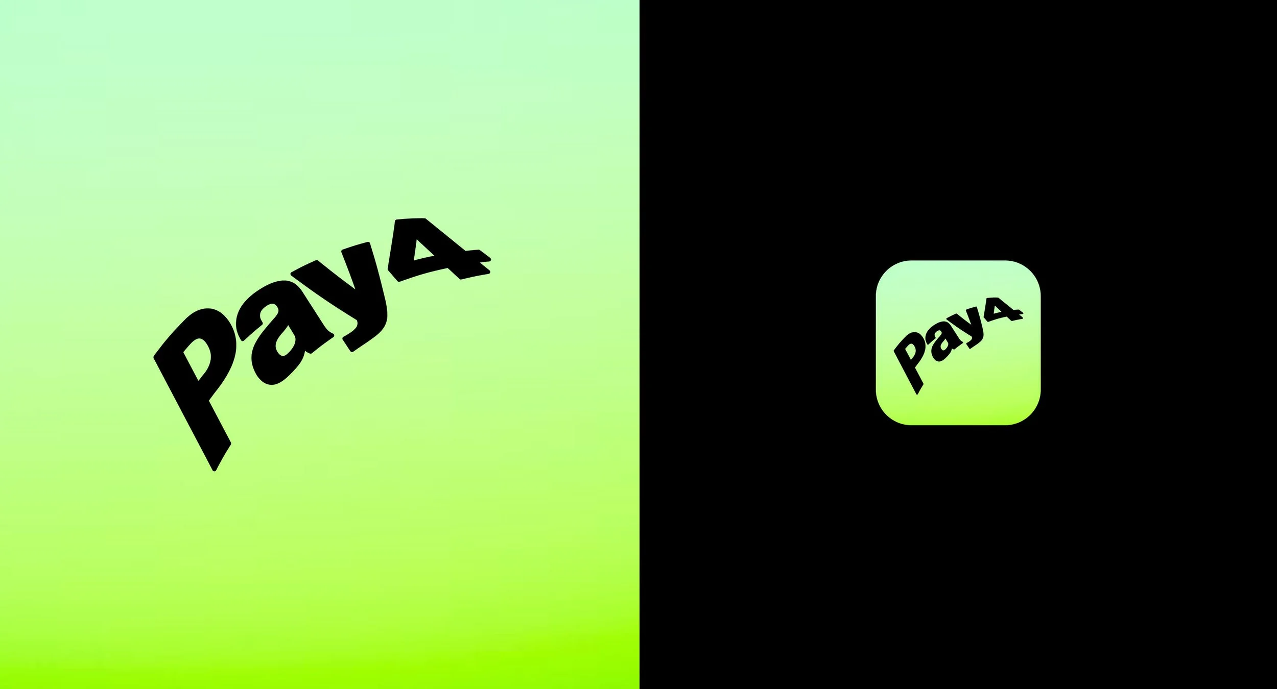
Pay4
[ Branding ]
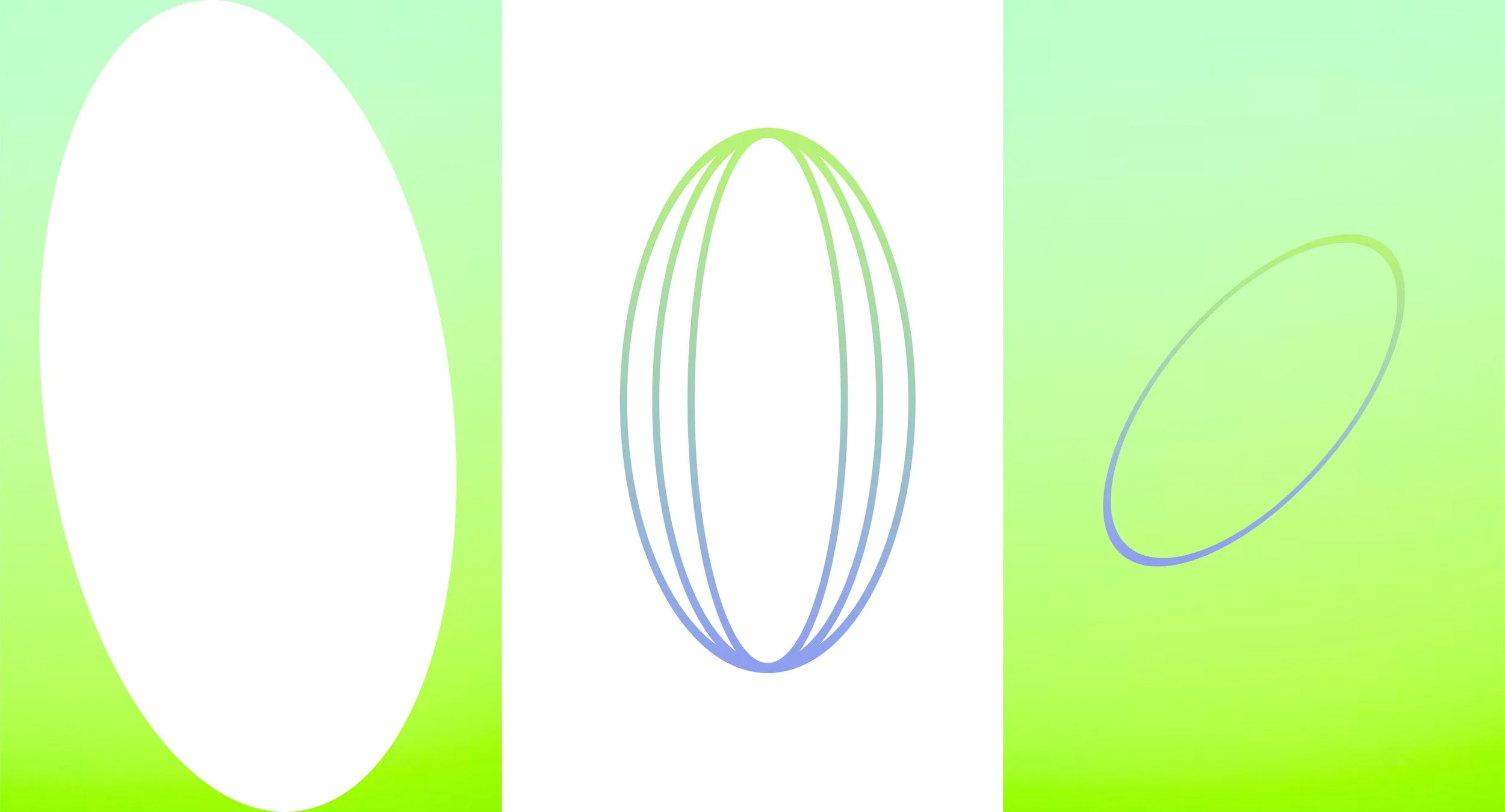
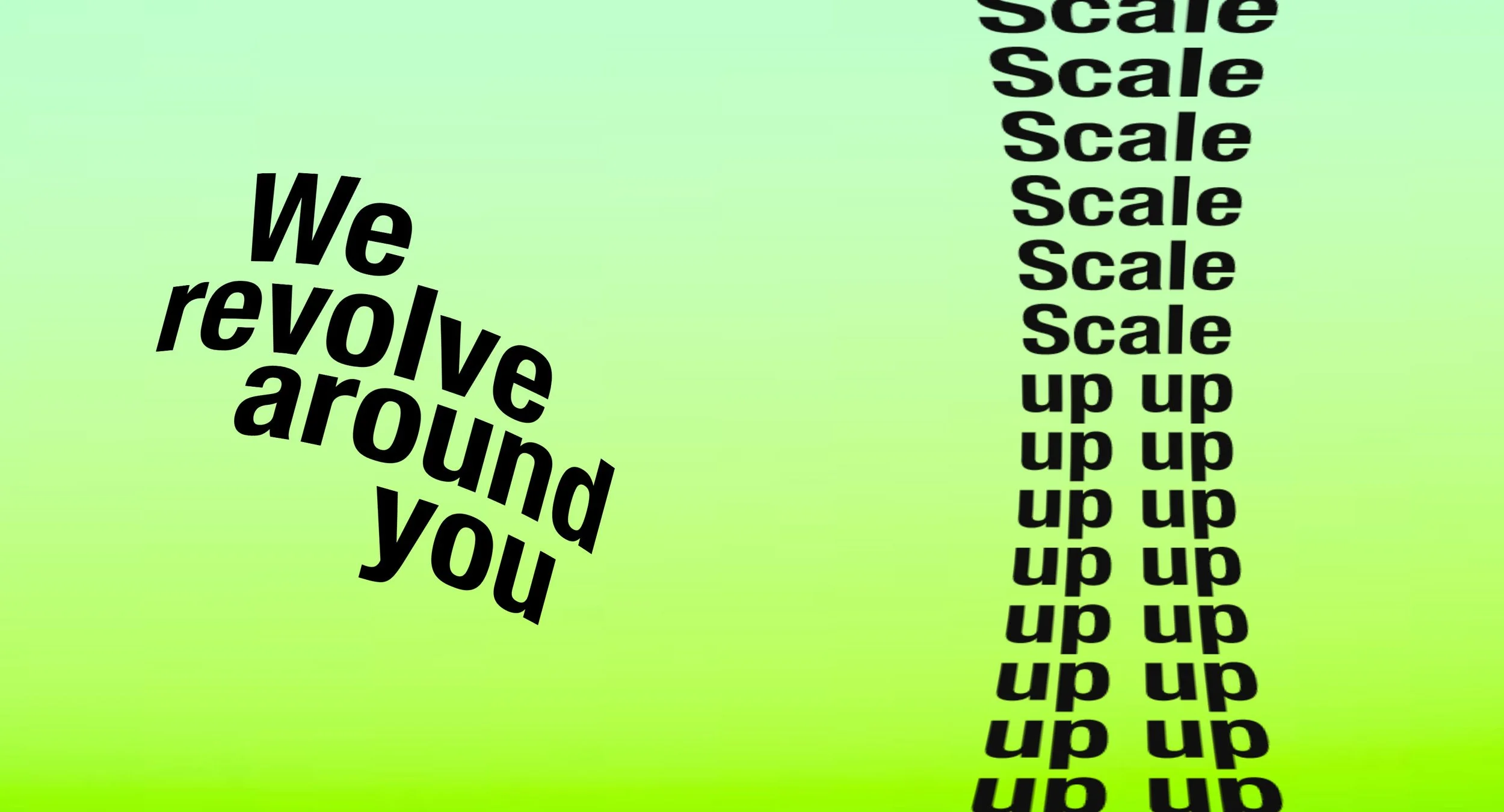
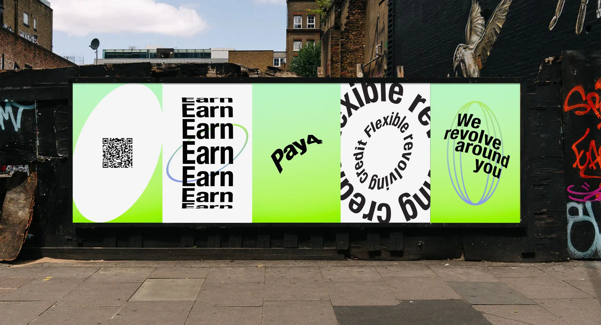
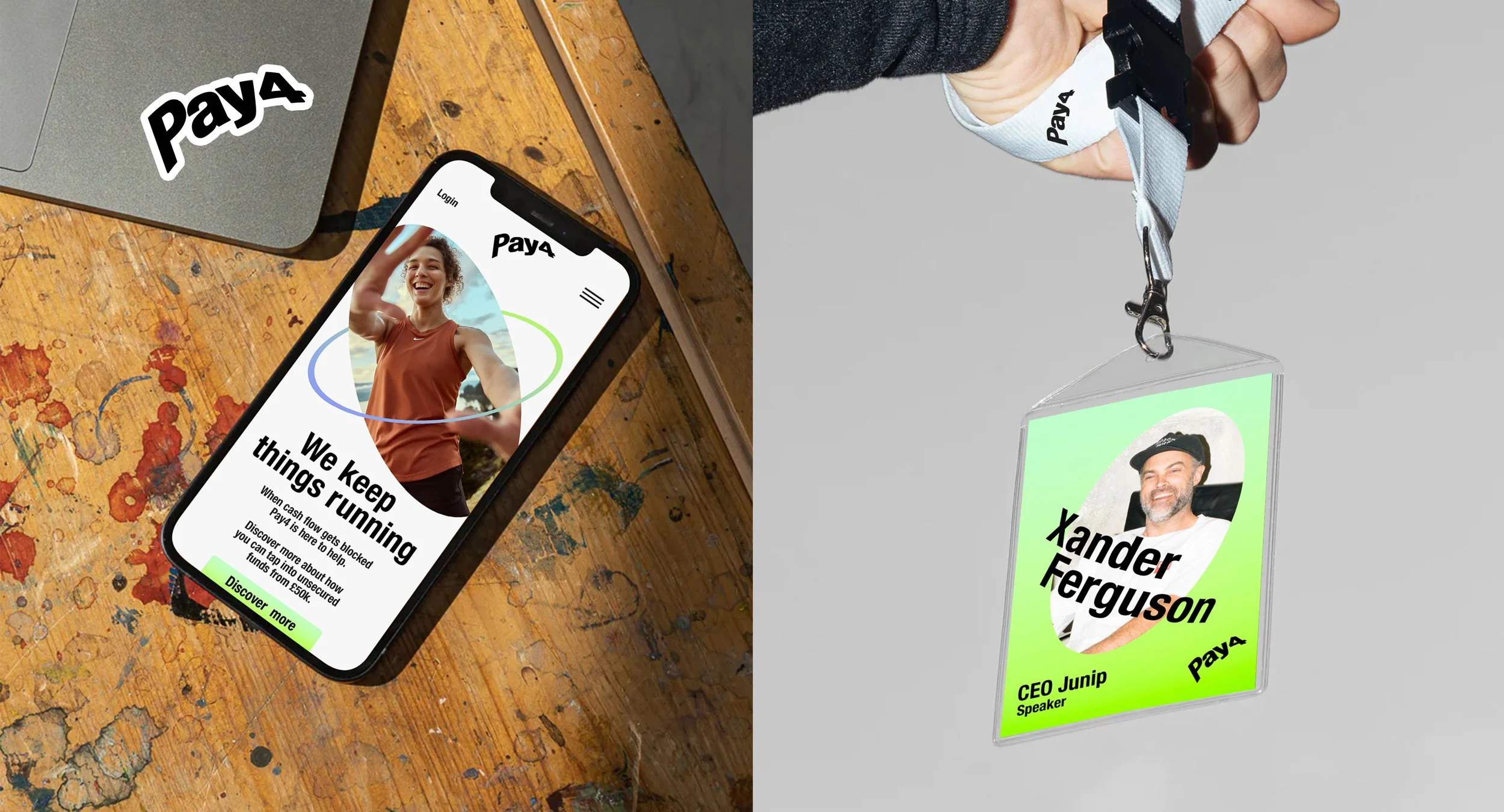
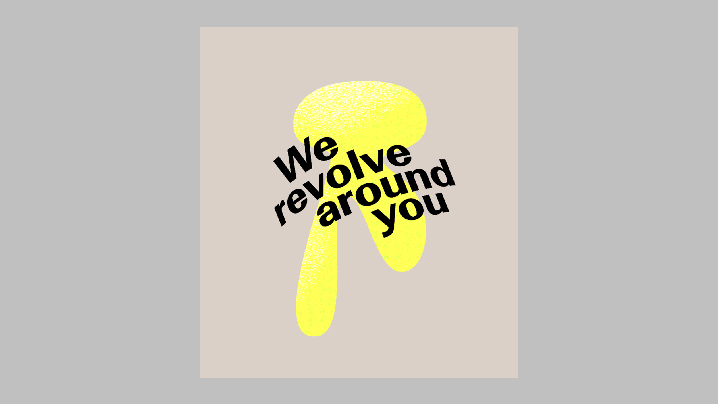
Pay4 is rooted in wrap around financial support for small businesses. Its flexible revolving credit inspired a constantly moving brand mark that orbits a central point. Using revolving as the icon of the identity the essence of the logo flexes across typography, graphic elements and photography as a cohesive design language.
[ Role : Art Director & Designer ]
[ The Background ]
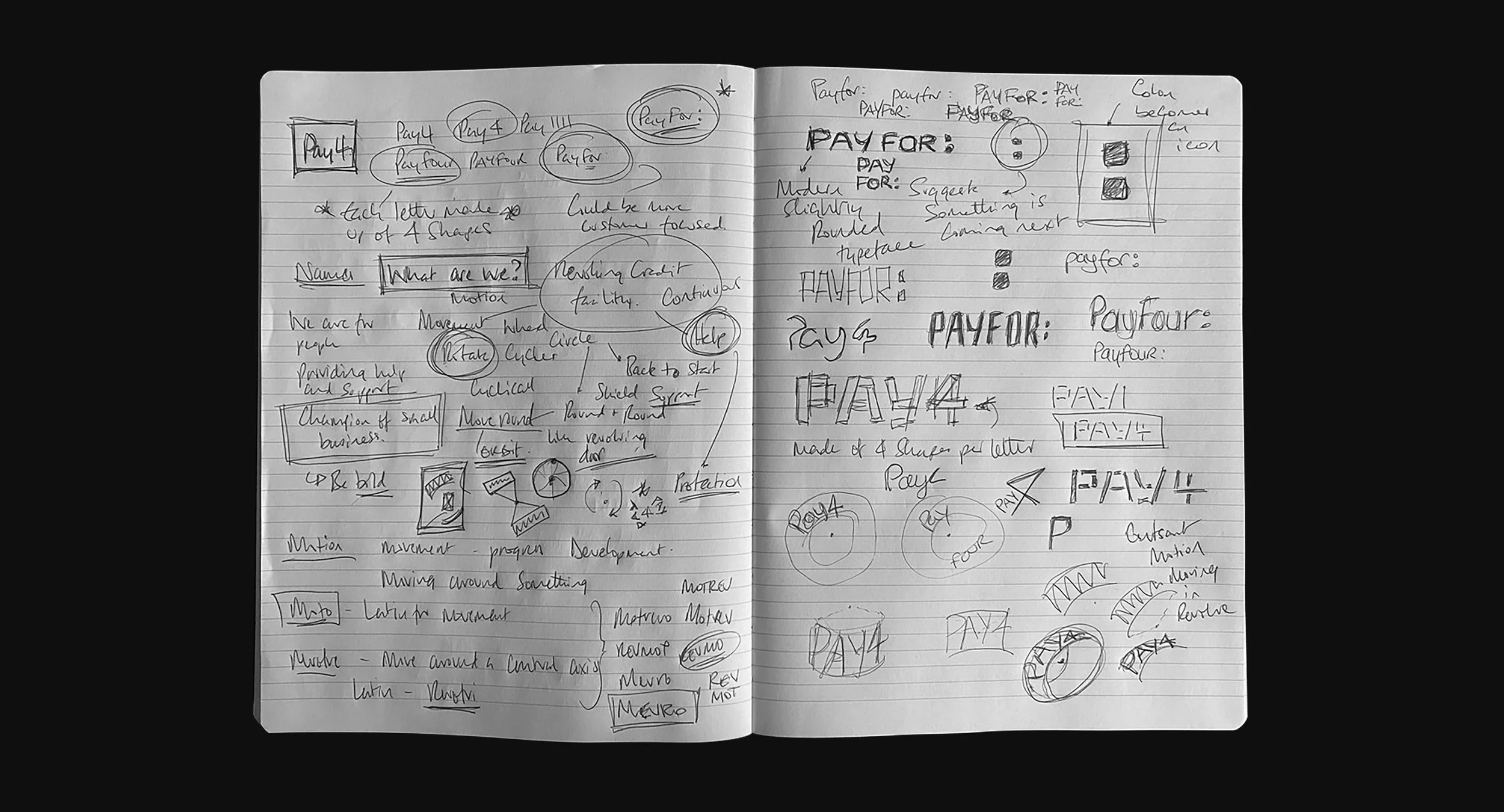
The project started with getting ideas, key words, feelings and rough designs down on paper before filtering through the content.
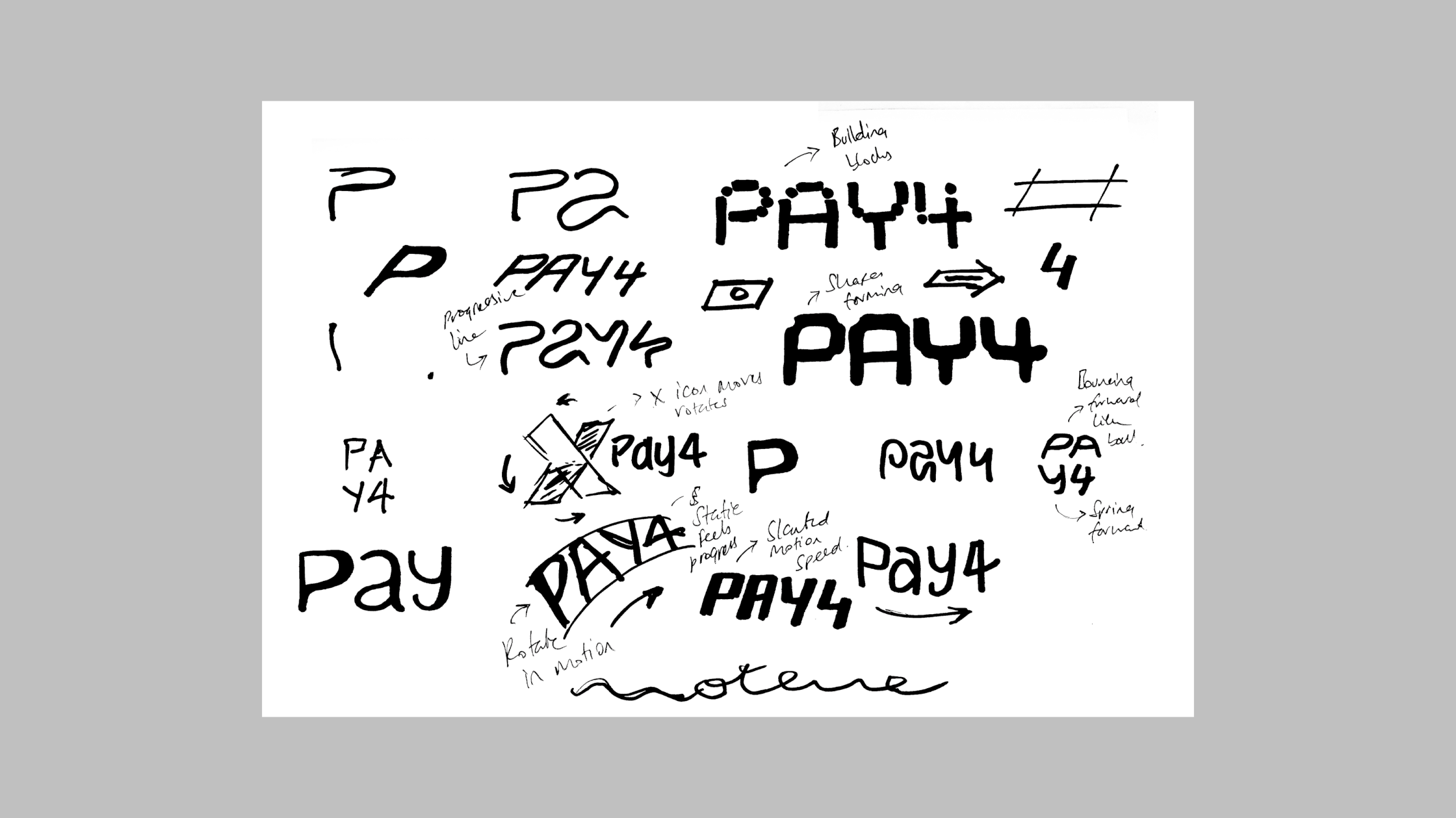
[ The Exploration ]
Building block, motion, states of flow, connection were investigated with an orbiting logo ultimately being chosen.
[ Brand design language ]
Art direction for the design language was developed through several days of exploration. Finalising in a cohesive flexible look.