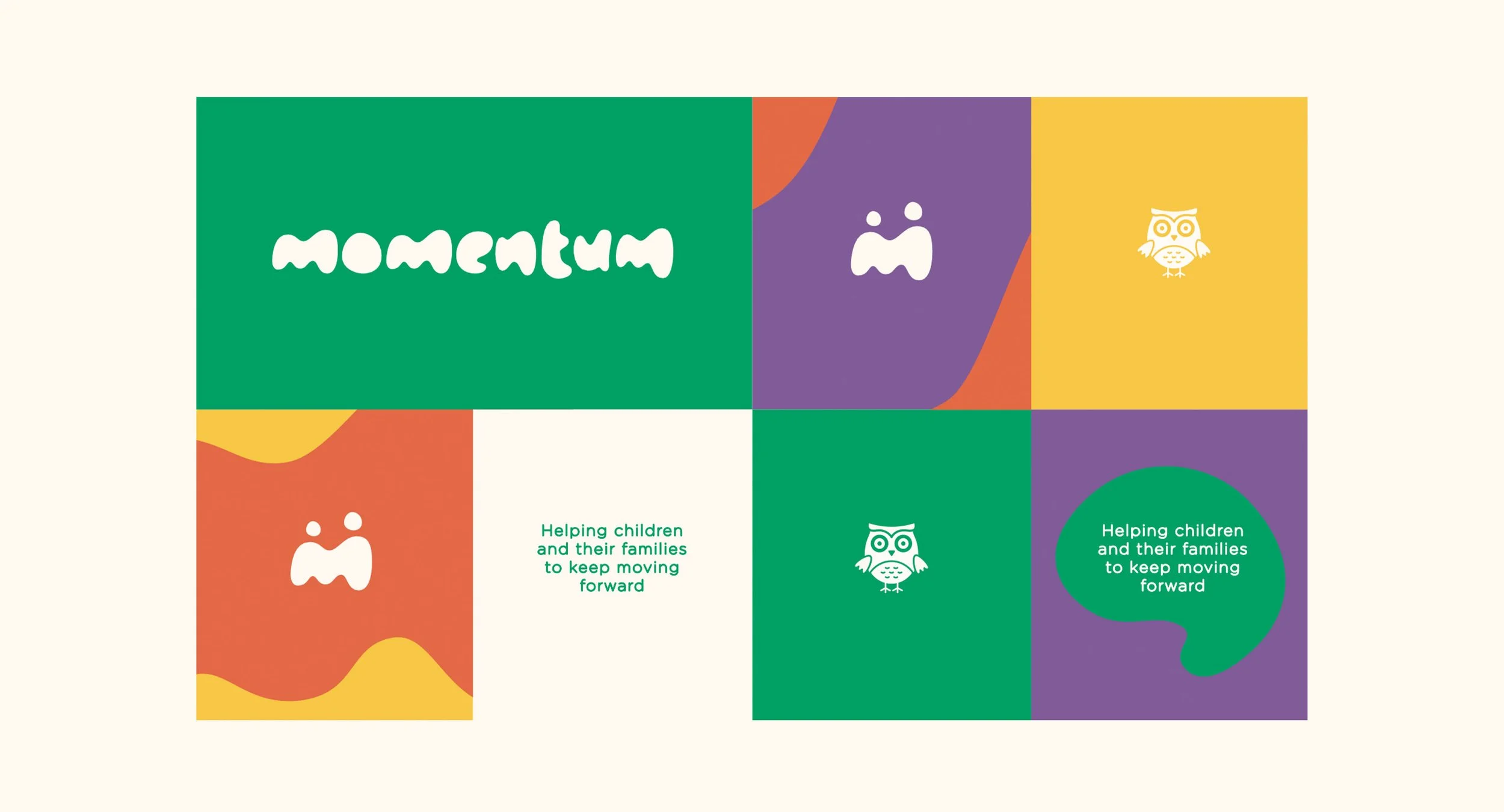
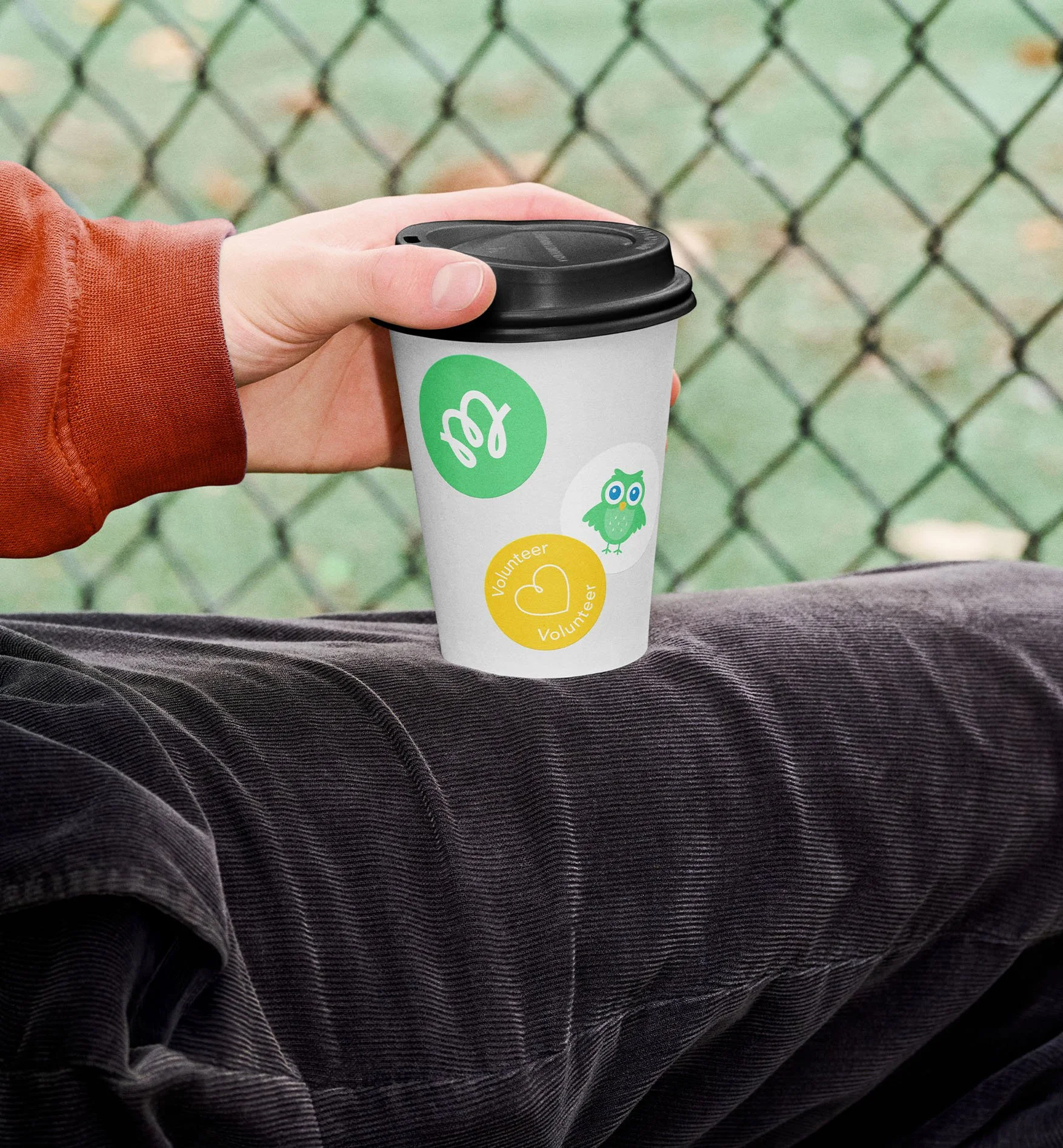
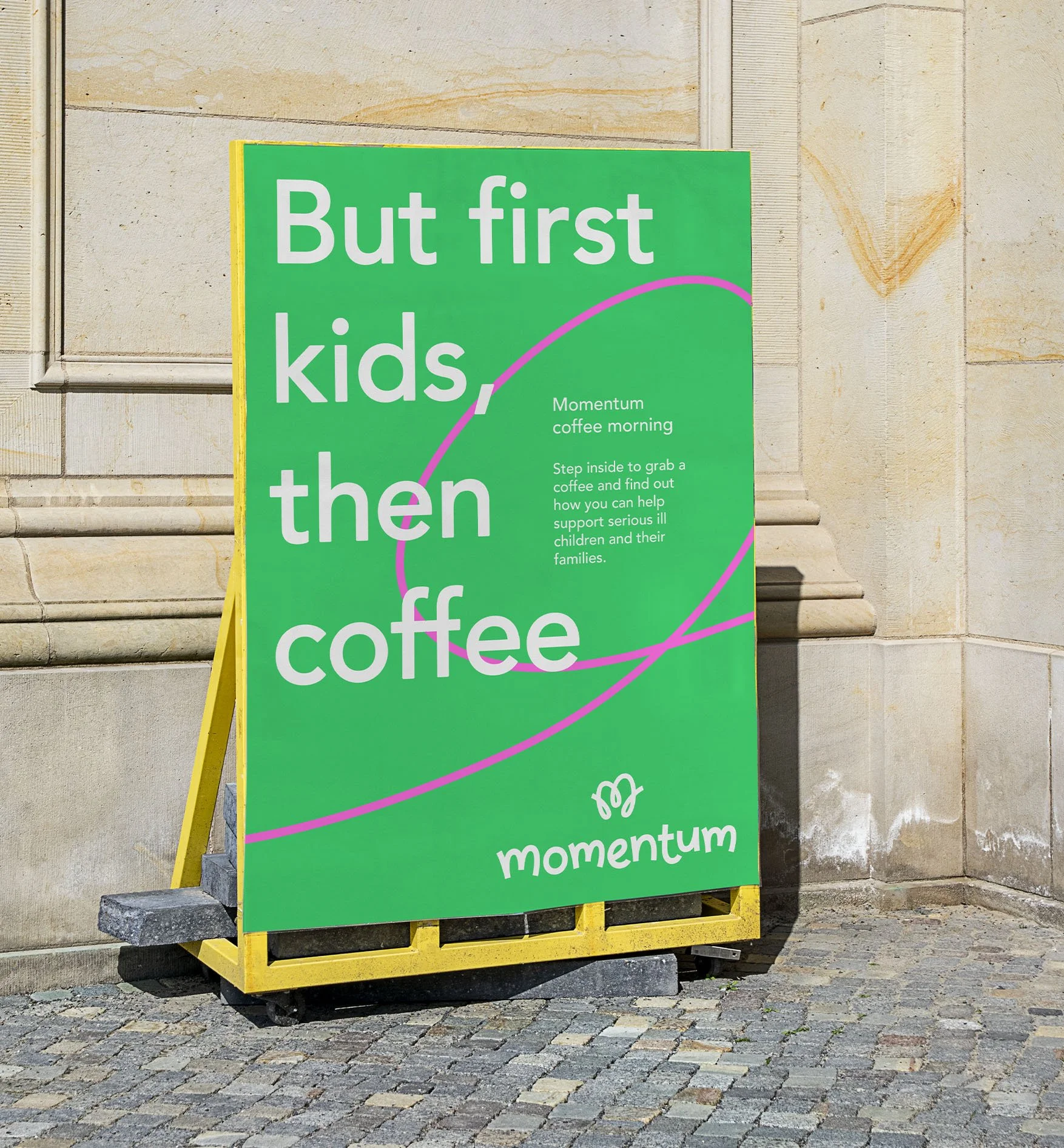
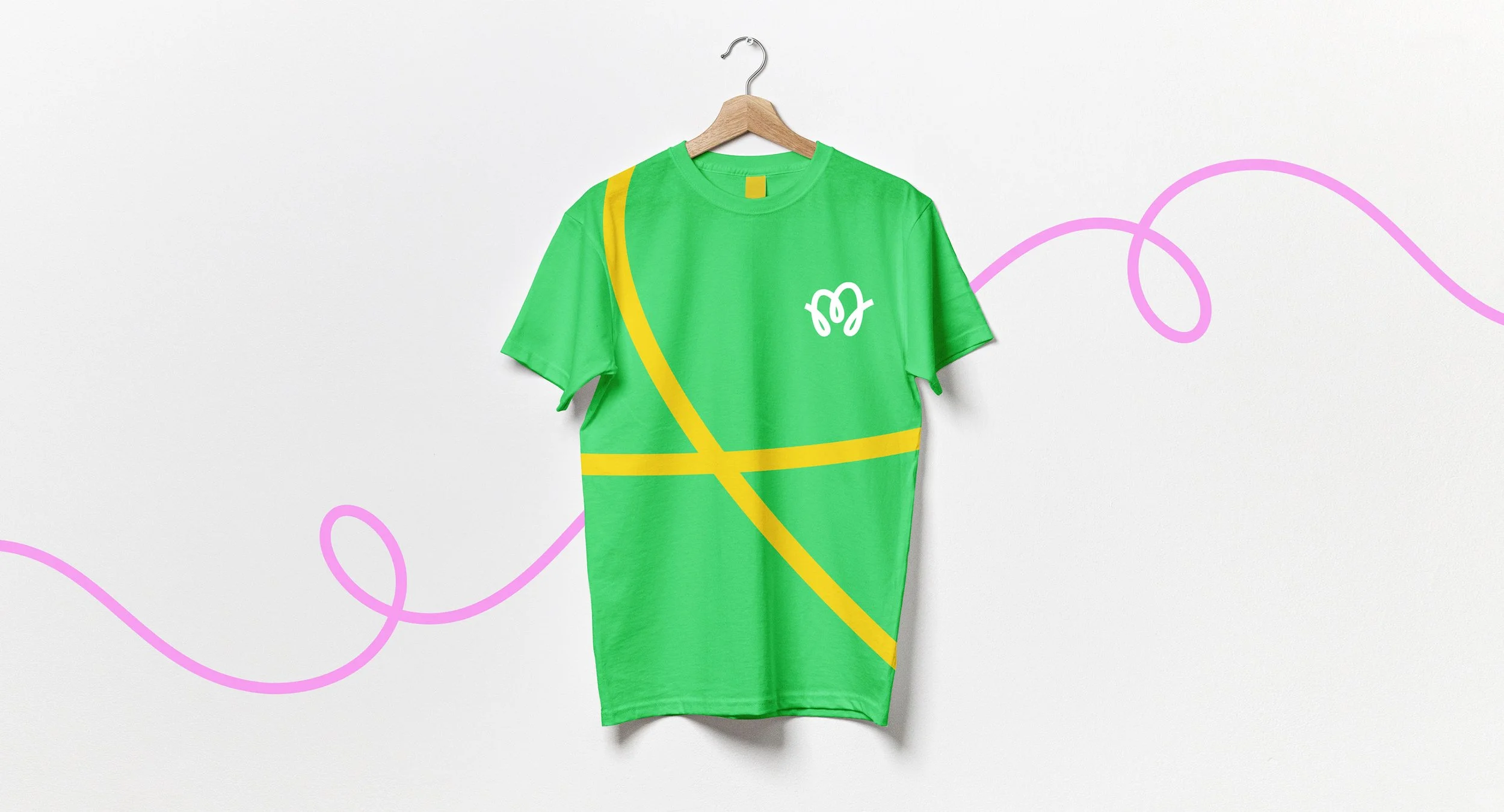
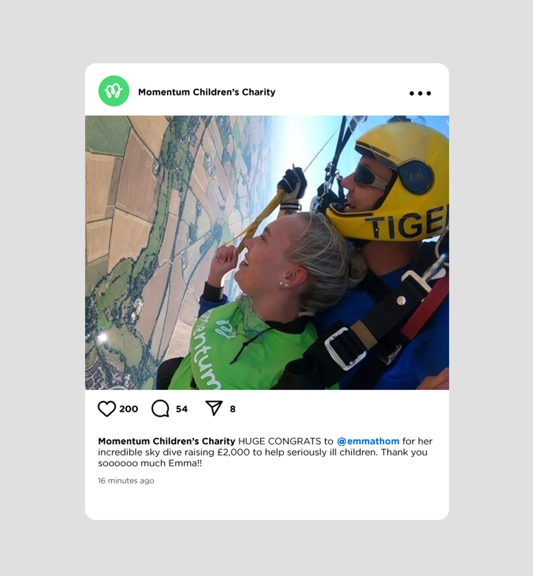
Momentum Children’s Charity
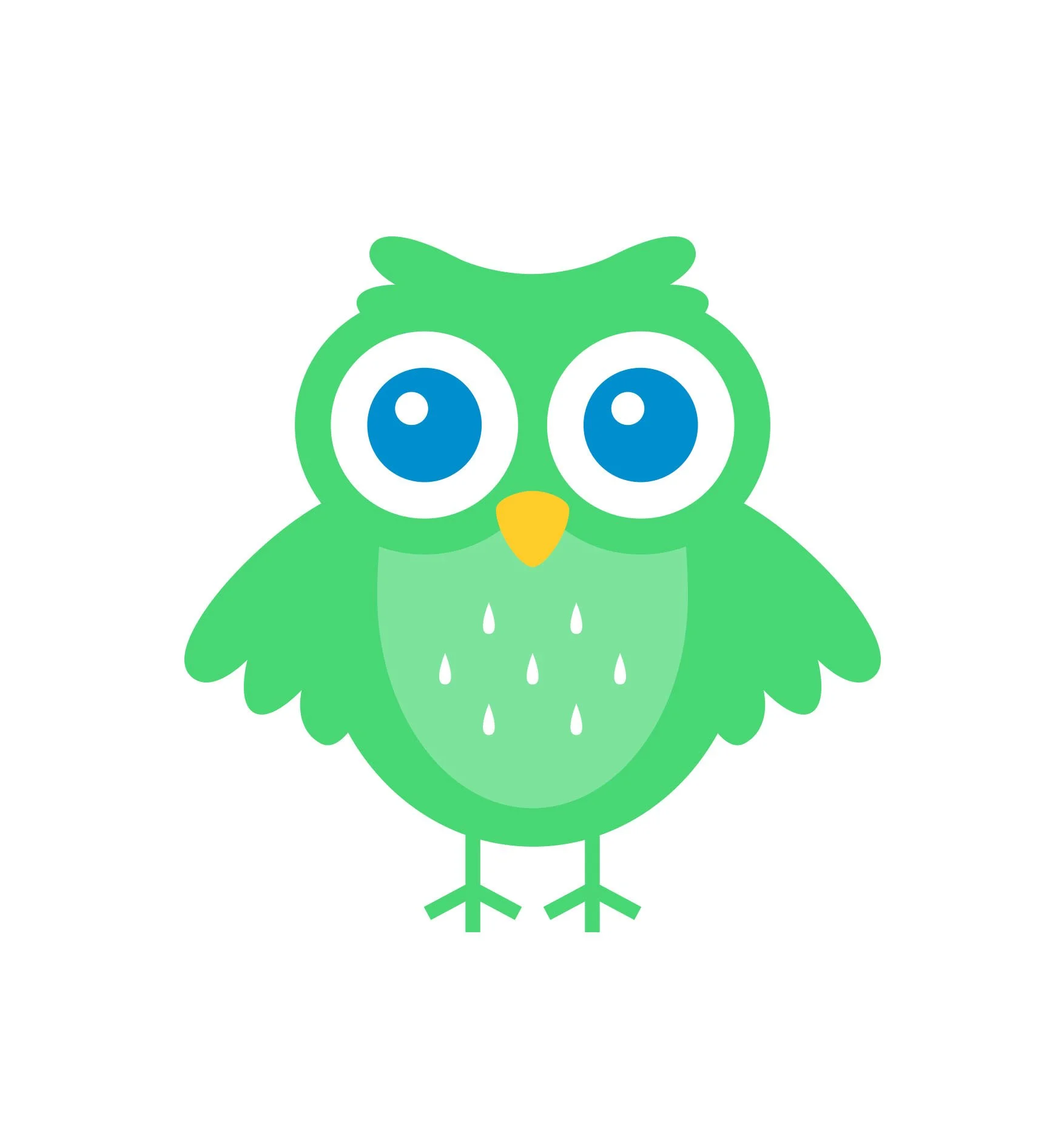
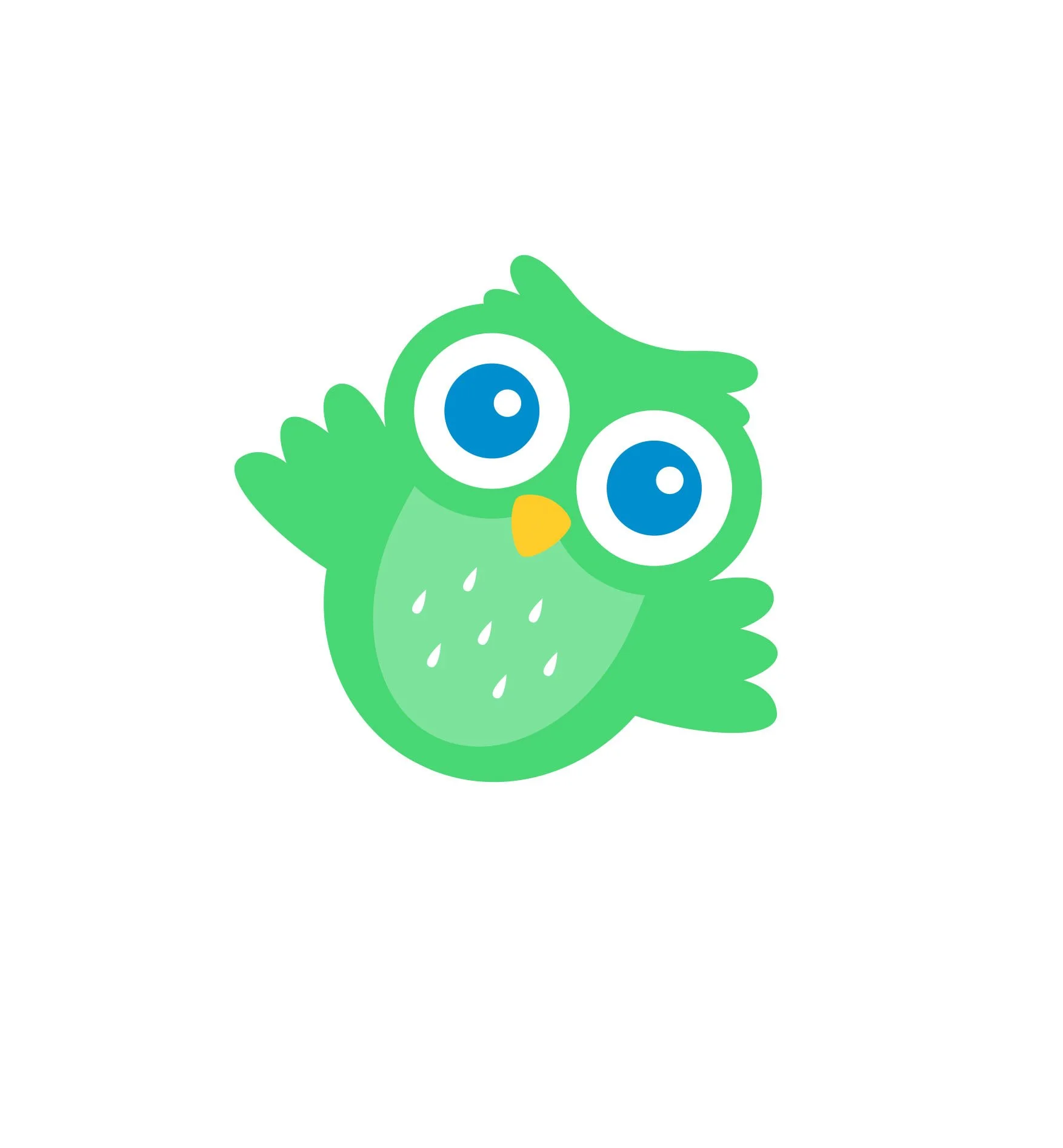
Brief --- Create a unified brand identity that expresses the charities mission of helping serious ill children and their families. Develop their mascot ‘Mo the owl’ and ensure the design system can be easily implemented by non-professional designers.
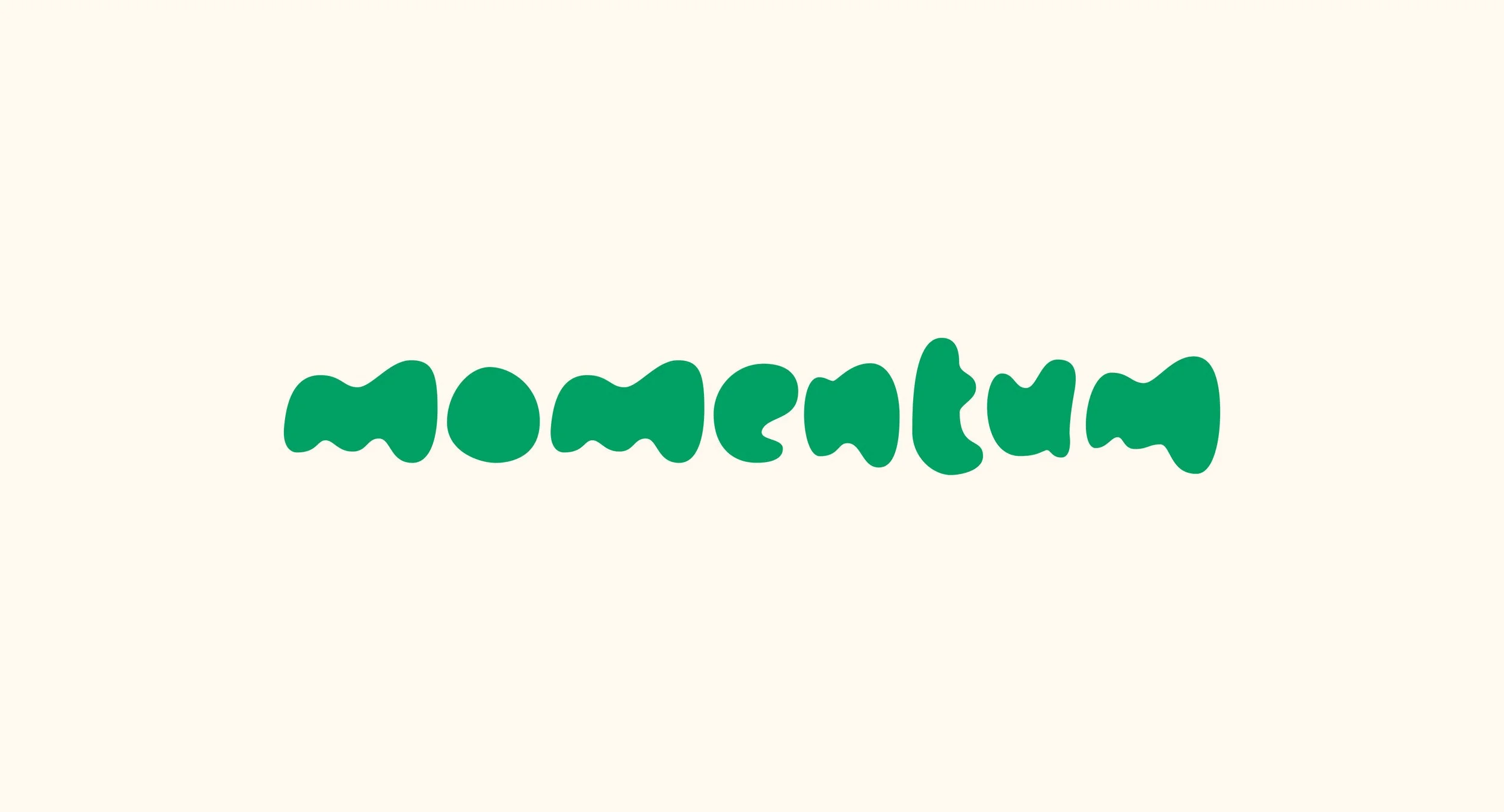
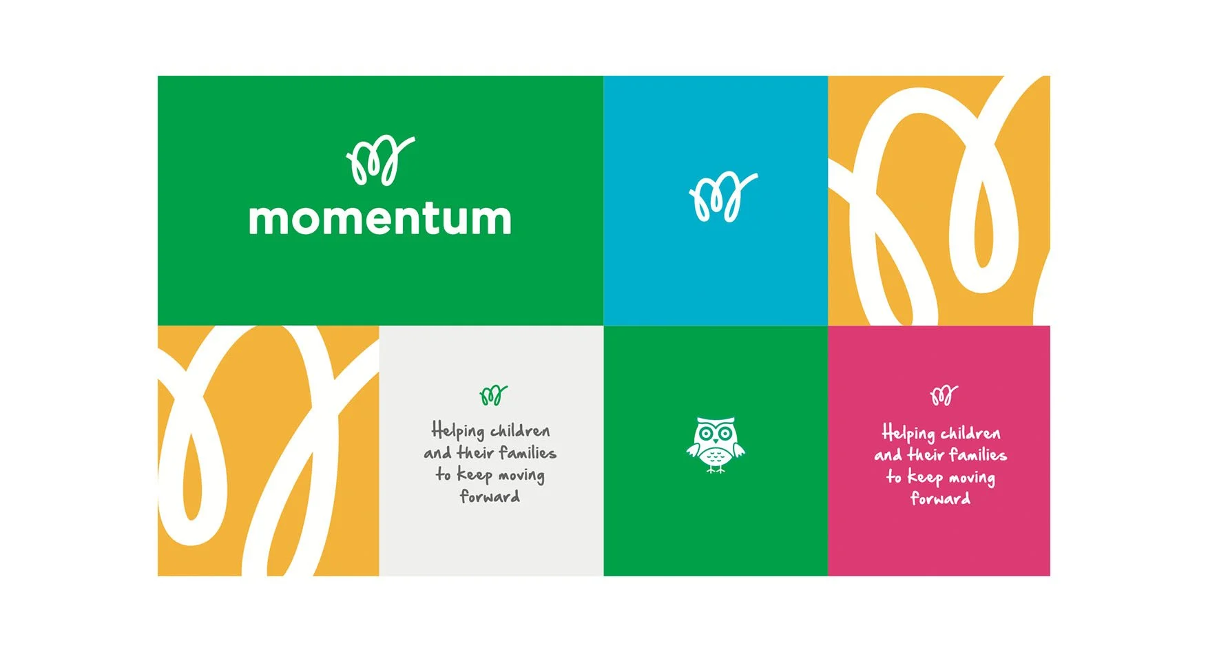
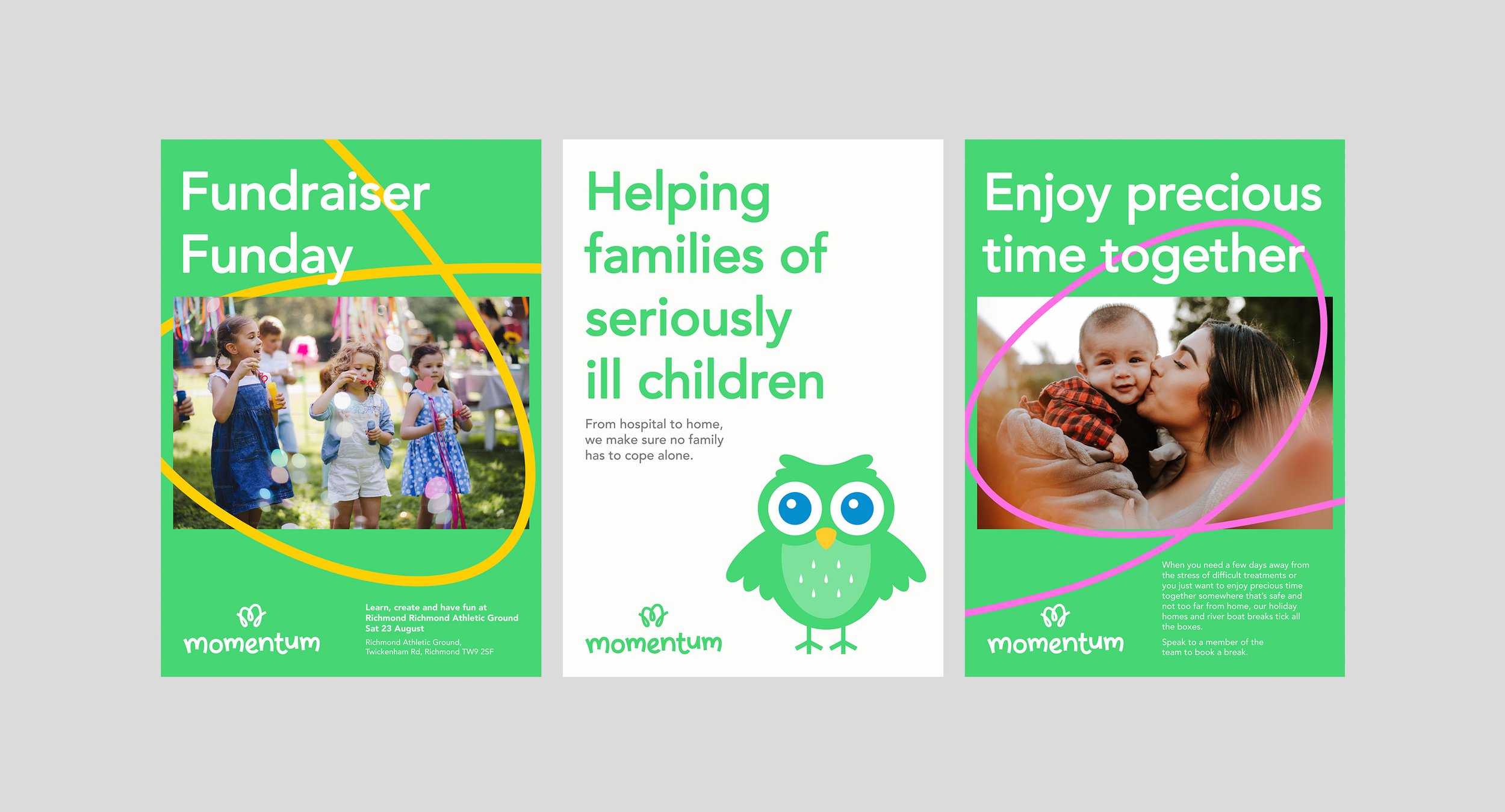
Solution --- A positive design language inspired by the attitude of young people on a extremely difficult journeys. Across the work we focus on memorable moments of hope and inspiration.
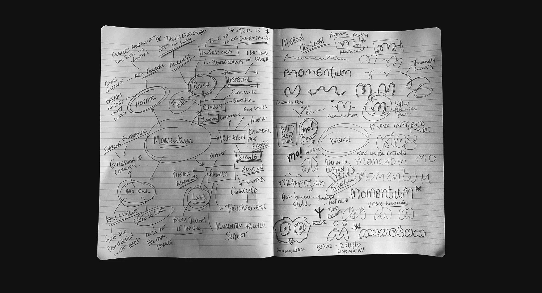
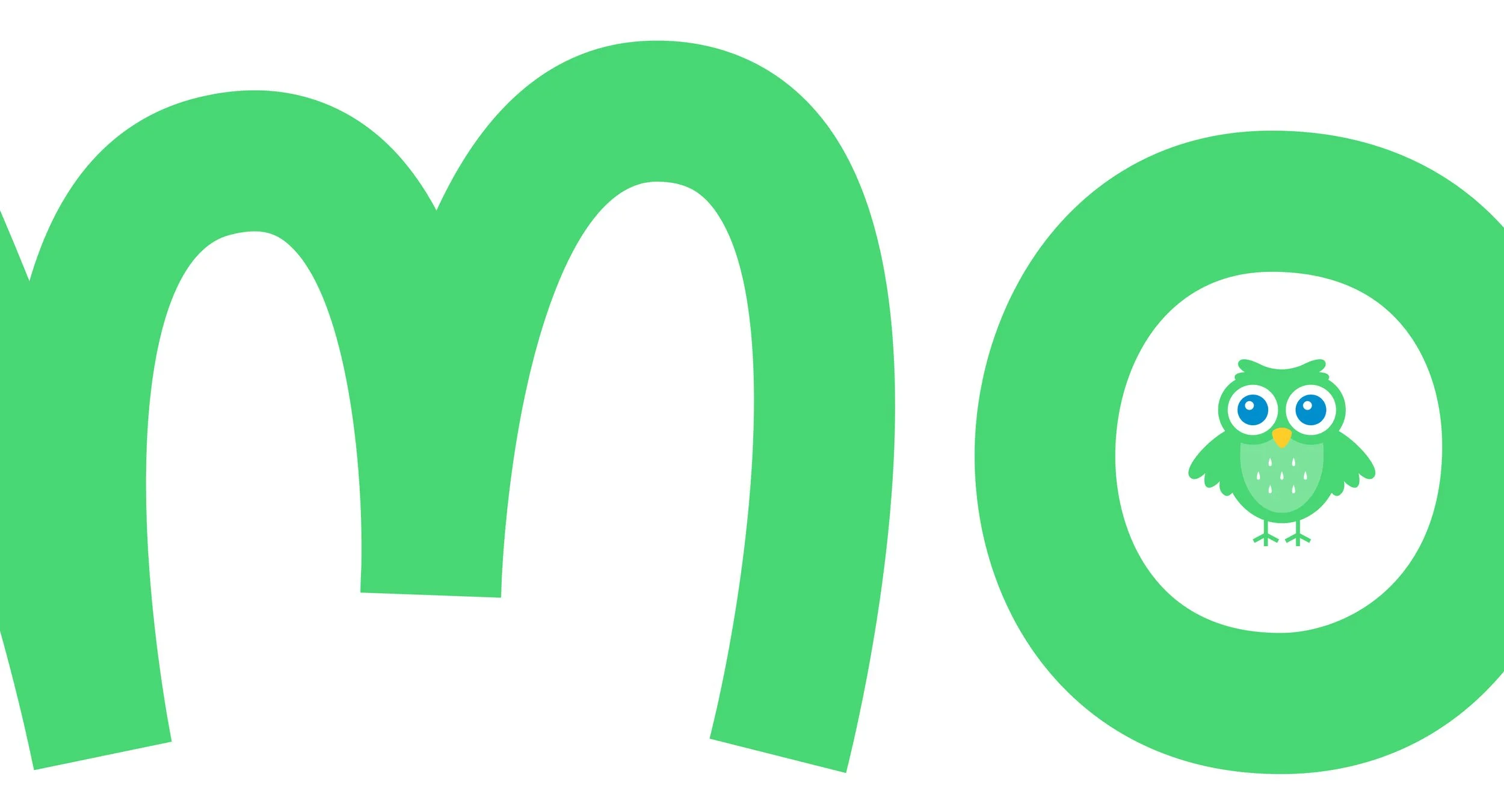
The creative stage began with exploring what the core of the charity was. With young people at the heart of the organisation I looked at their journeys, what the charity meant to them and was to connect with families creatively. One option was inspired by children’s bubble writing and the M mark bring people together. The chosen option was inspired by people’s journeys with serious illness with a focus on momentum through the M mark.
Charity re-brand
Role --- Lead Designer
Software --- Illustrator & Photoshop