Orchards. Sunshine.
Wooden crates. Insta filters.
Jack launches a cider.
Jack Daniel’s Cider •
Launch Campaign UK
Senior Designer •
Visual System & Type Design
Background
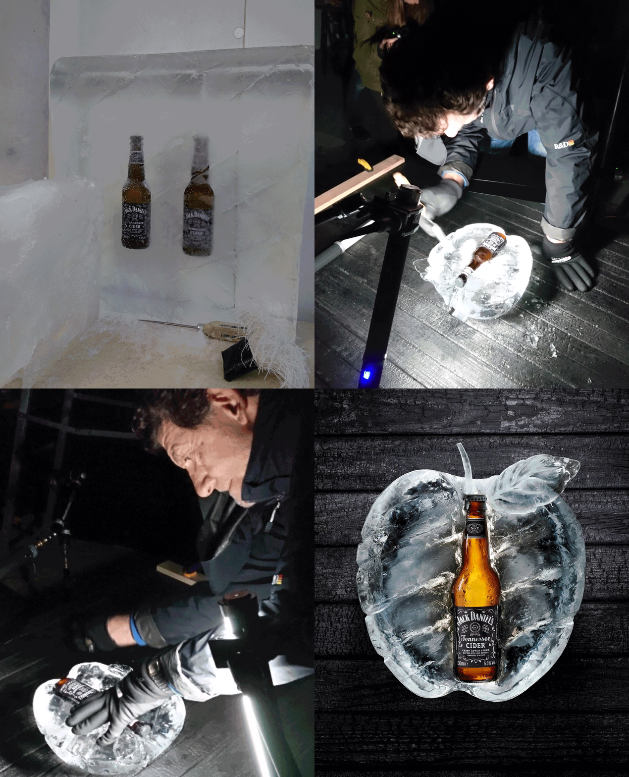
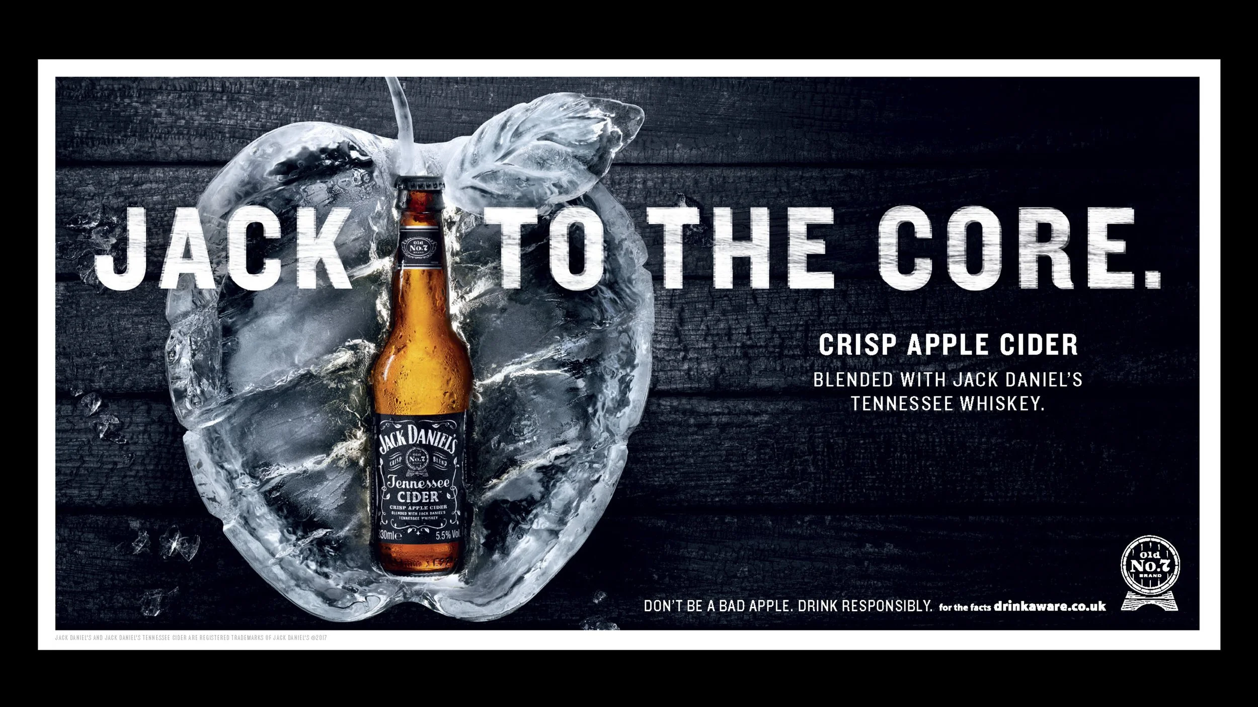
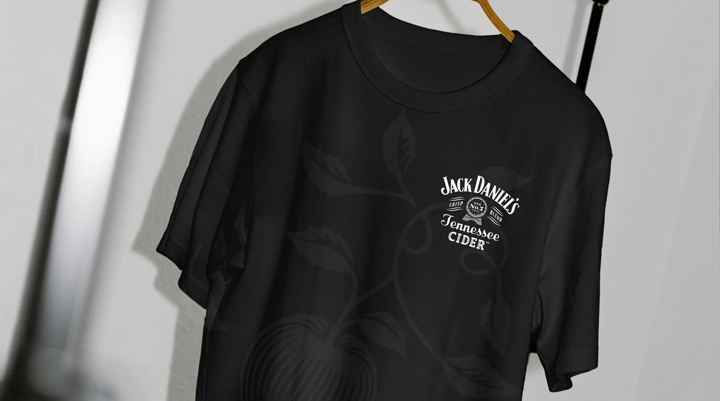
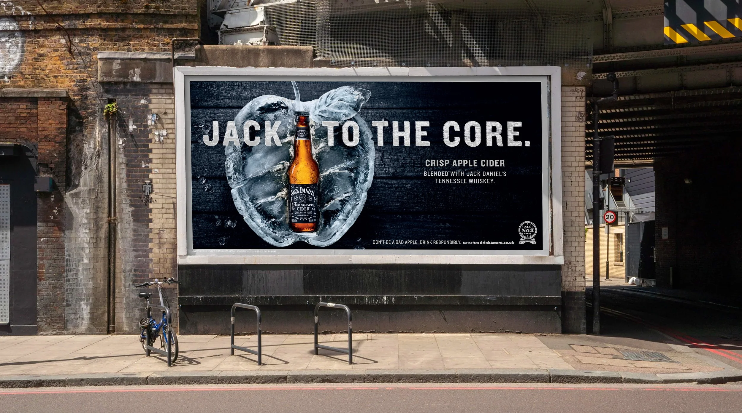
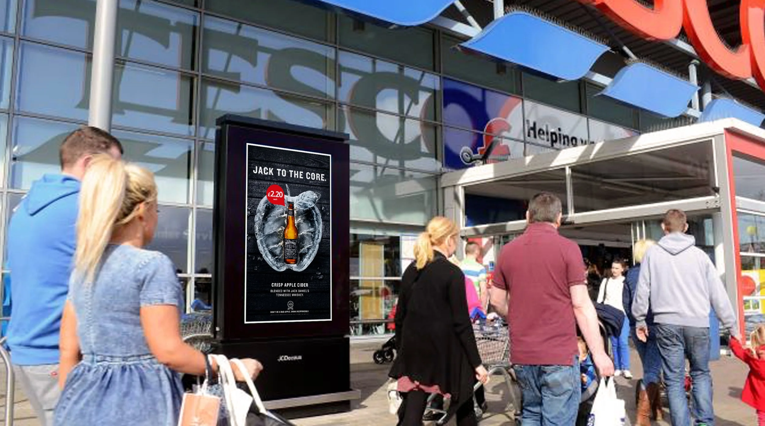
The concept was developed by a creative team, I joined as the Senior Designer to define the design language. A wooden route lost out to a sculpted ice apple that expressed all that’s loved about Jack - flavour, craft and a bit of something different.
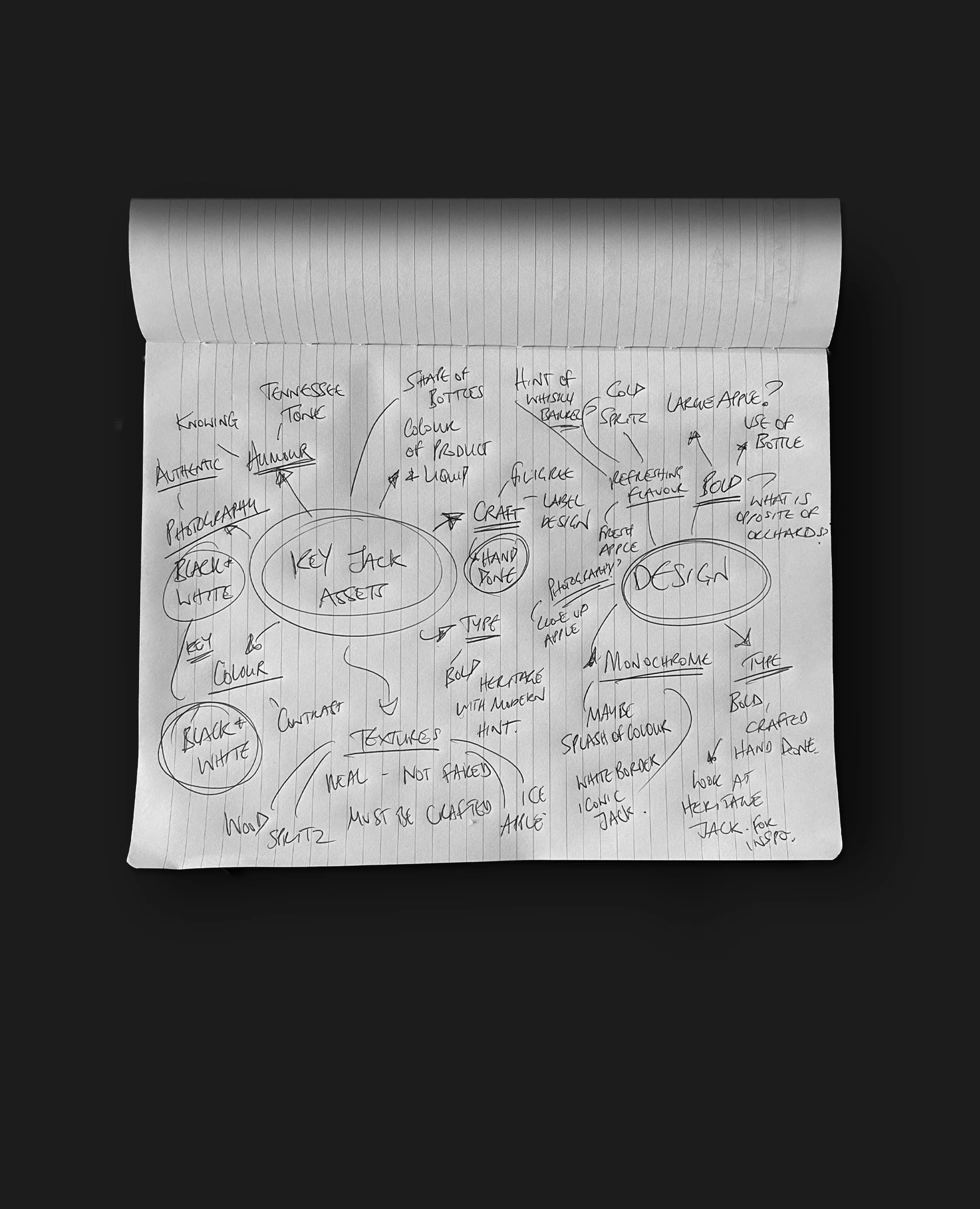
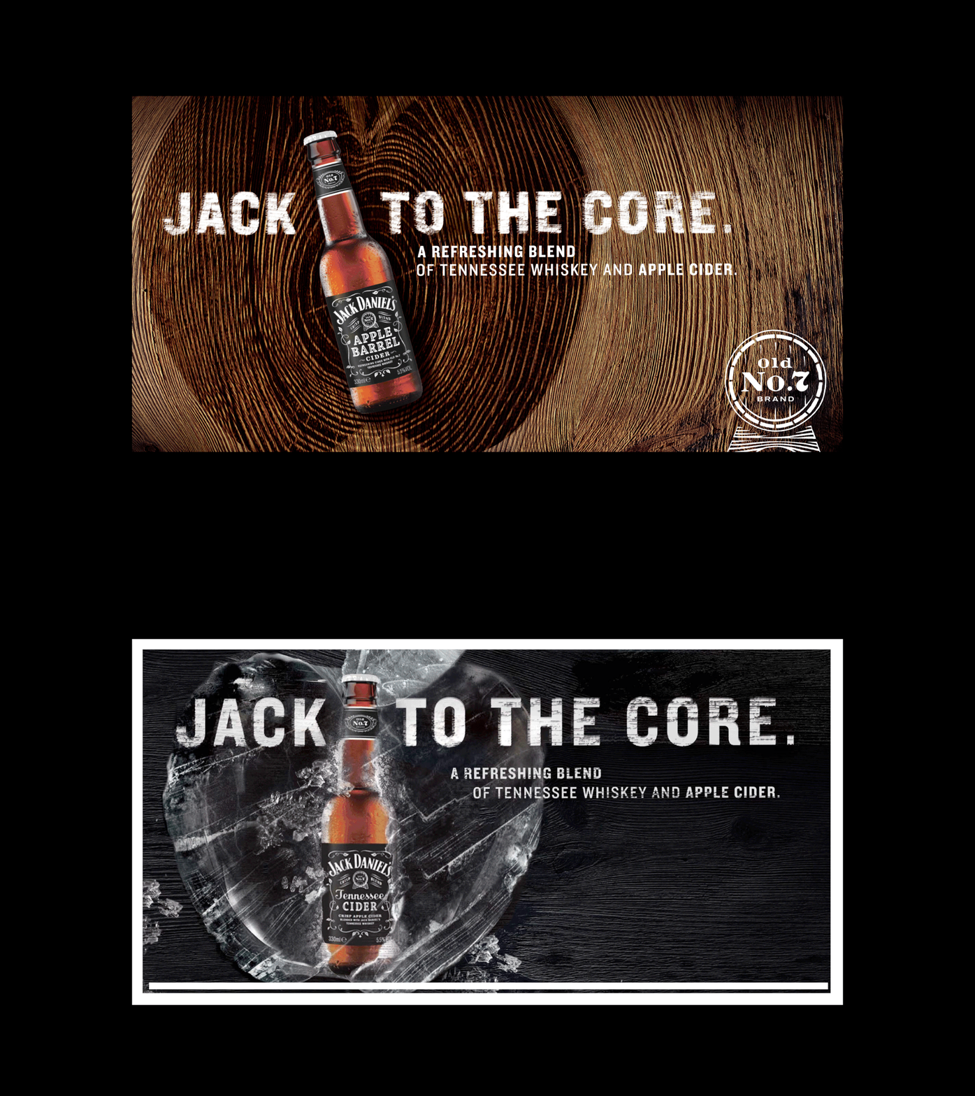
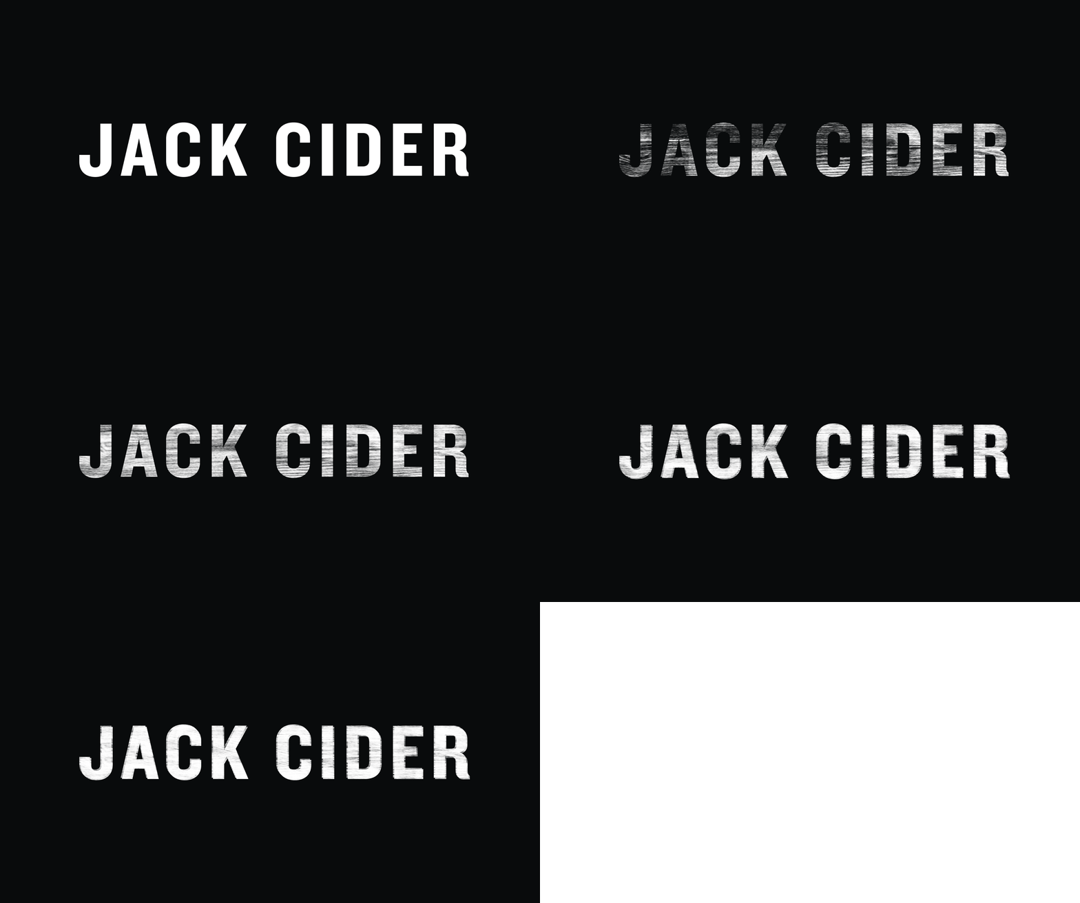
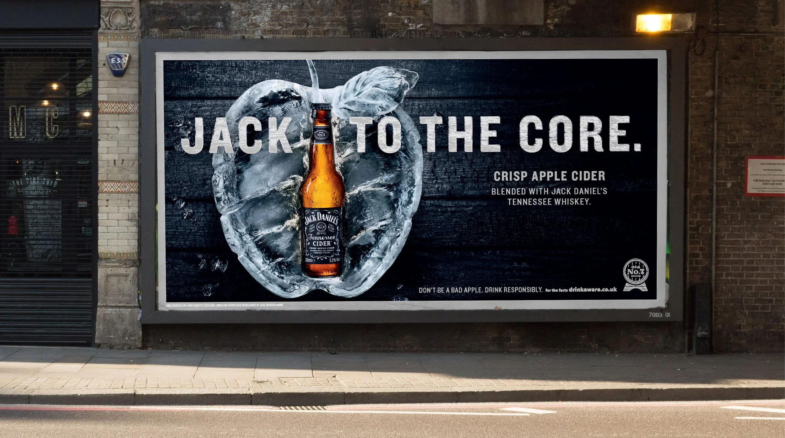
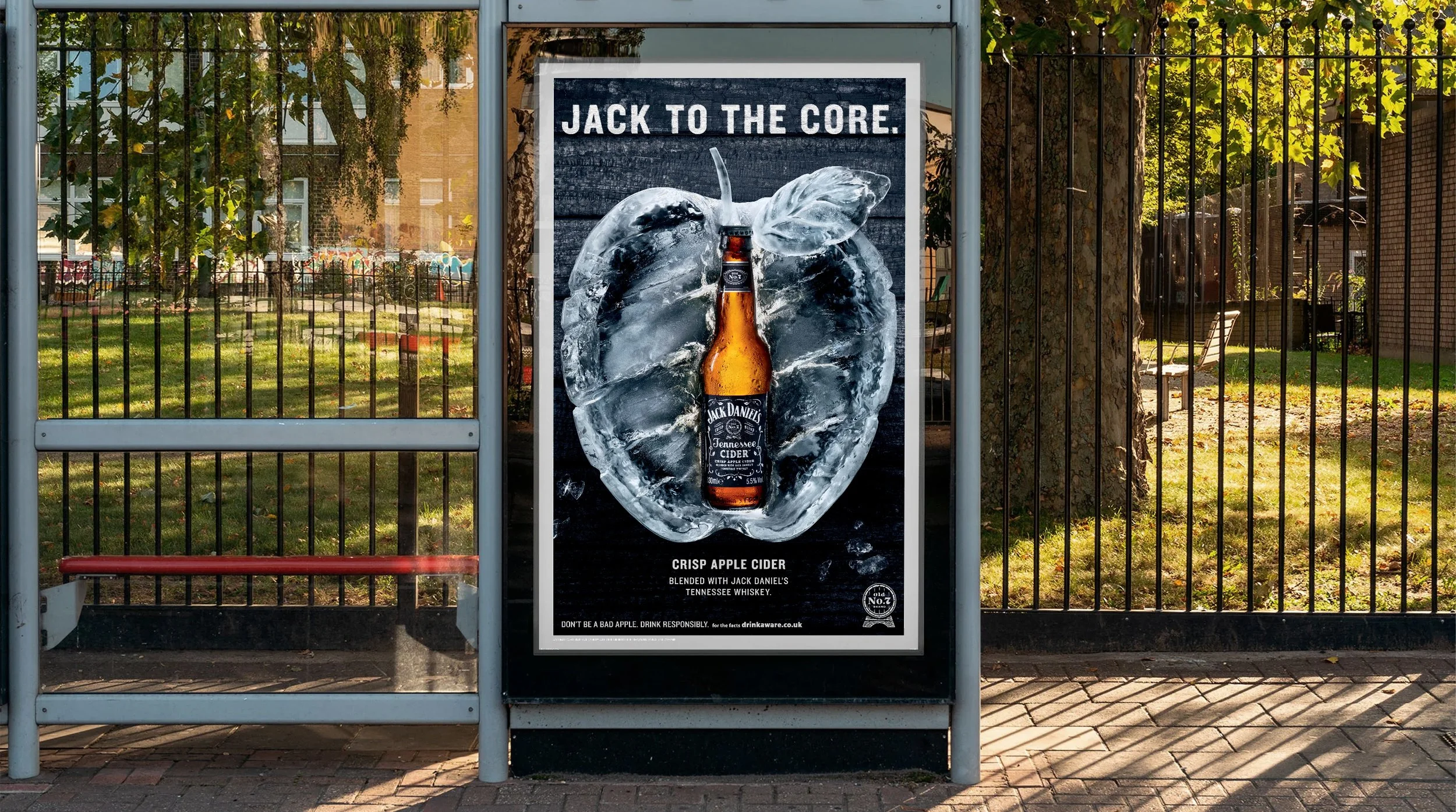
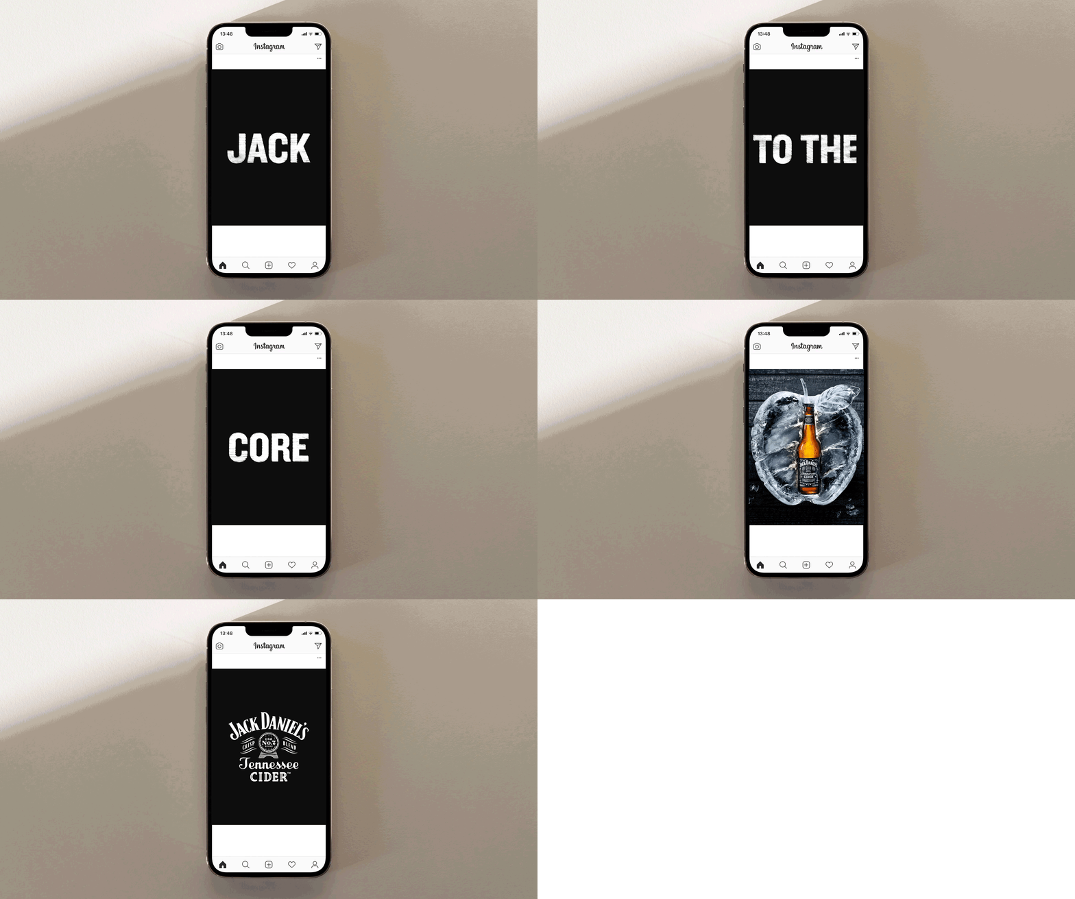
The typographic style plays into the rugged, textured visual language of Jack Daniel’s. The monochromatic palette was an intentional switch from the saturated orchards of competitors and connected with Jacks rebellious streak.